POLIMI LIBRARY Redesign
Type
Year
Key Words
Design In University
2022
UI/UX Mobile User Test
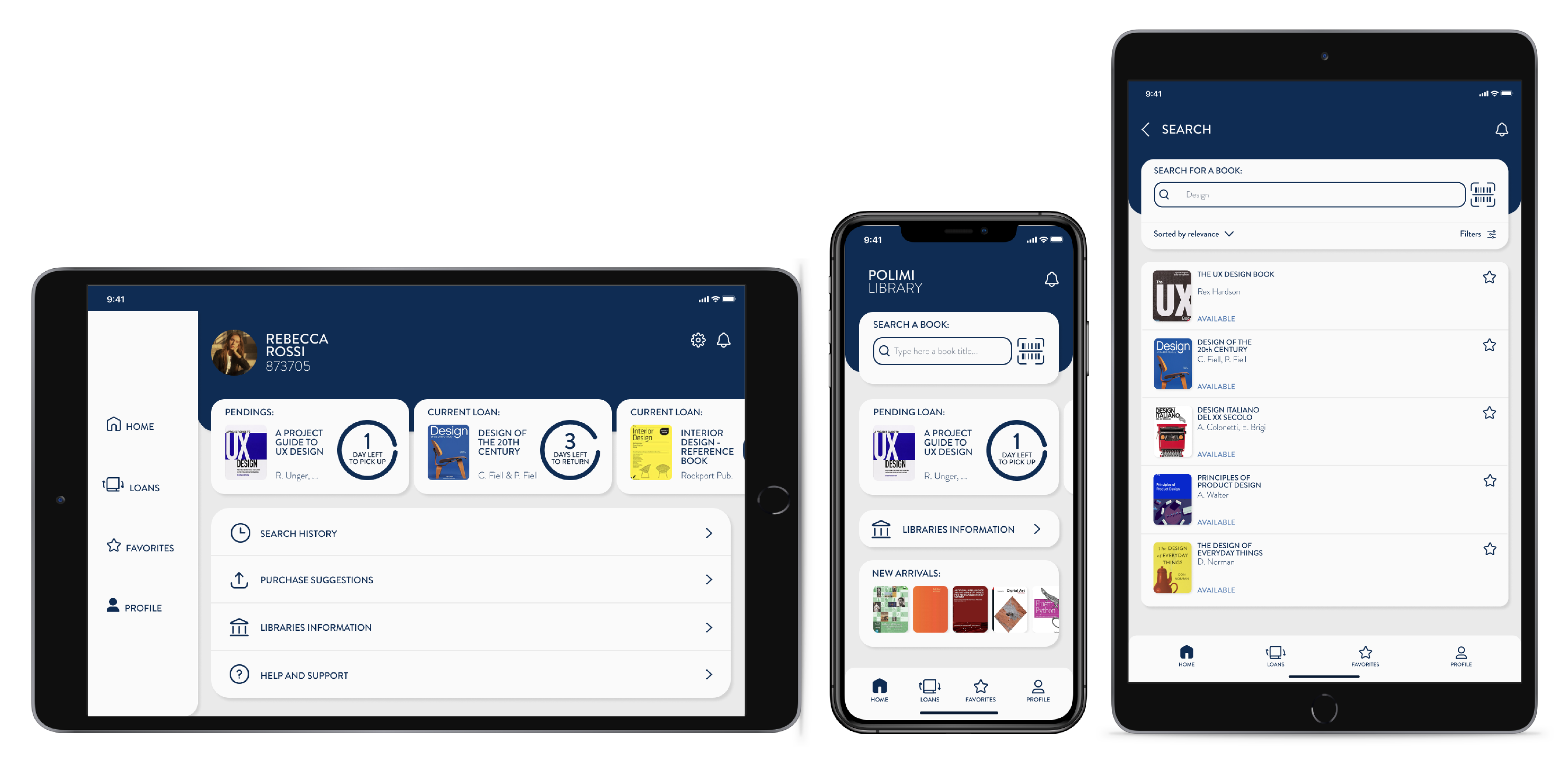
POLIMI LIBRARY Redesign
POLIMI LIBRARY is an app designed for students at Politecnico di Milano to borrow and rent books. However, the original version received complains from both students and professors regarding its user experience. To address these concerns, we took this opportunity to redesign the Polimi Library app.

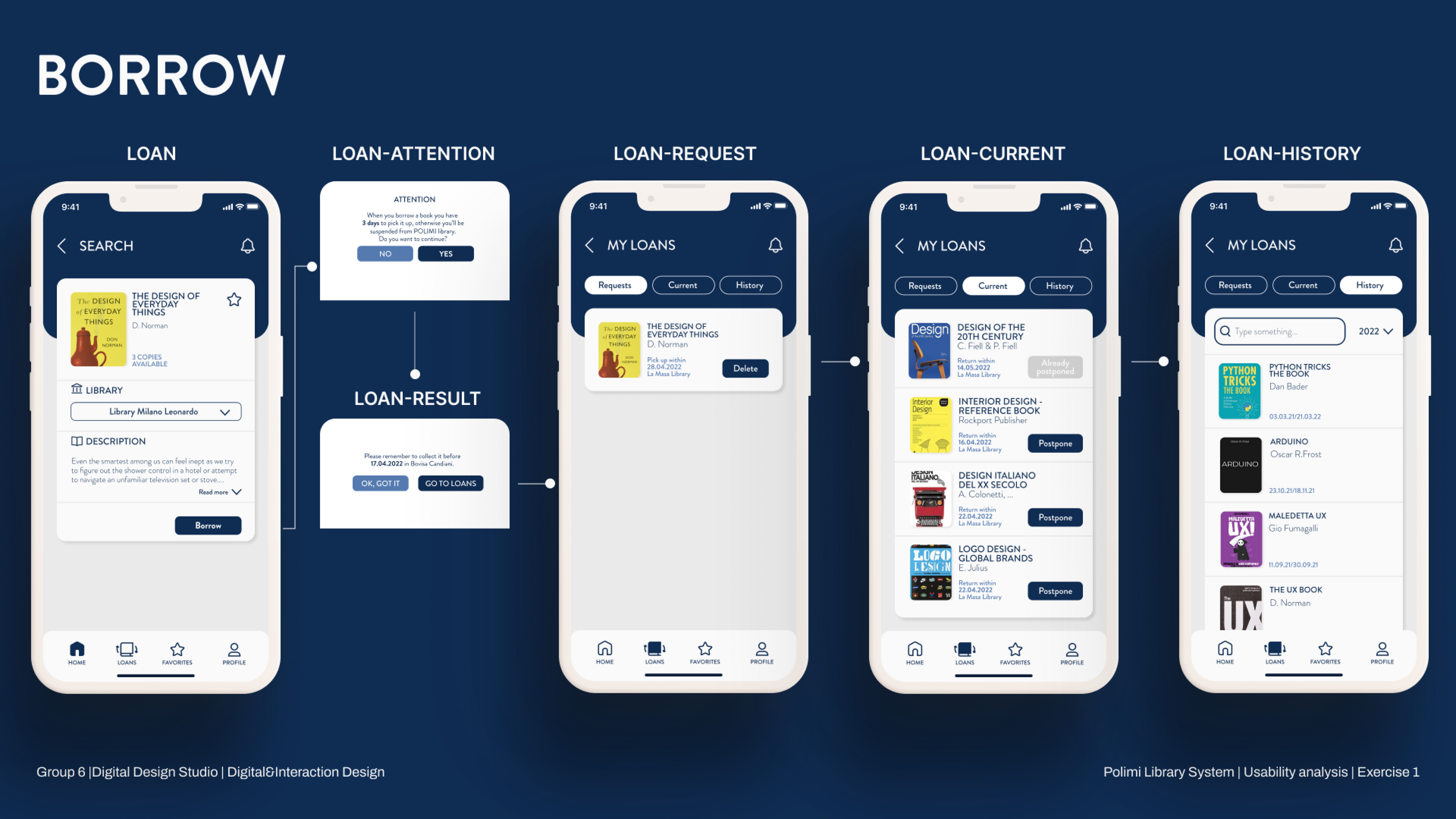
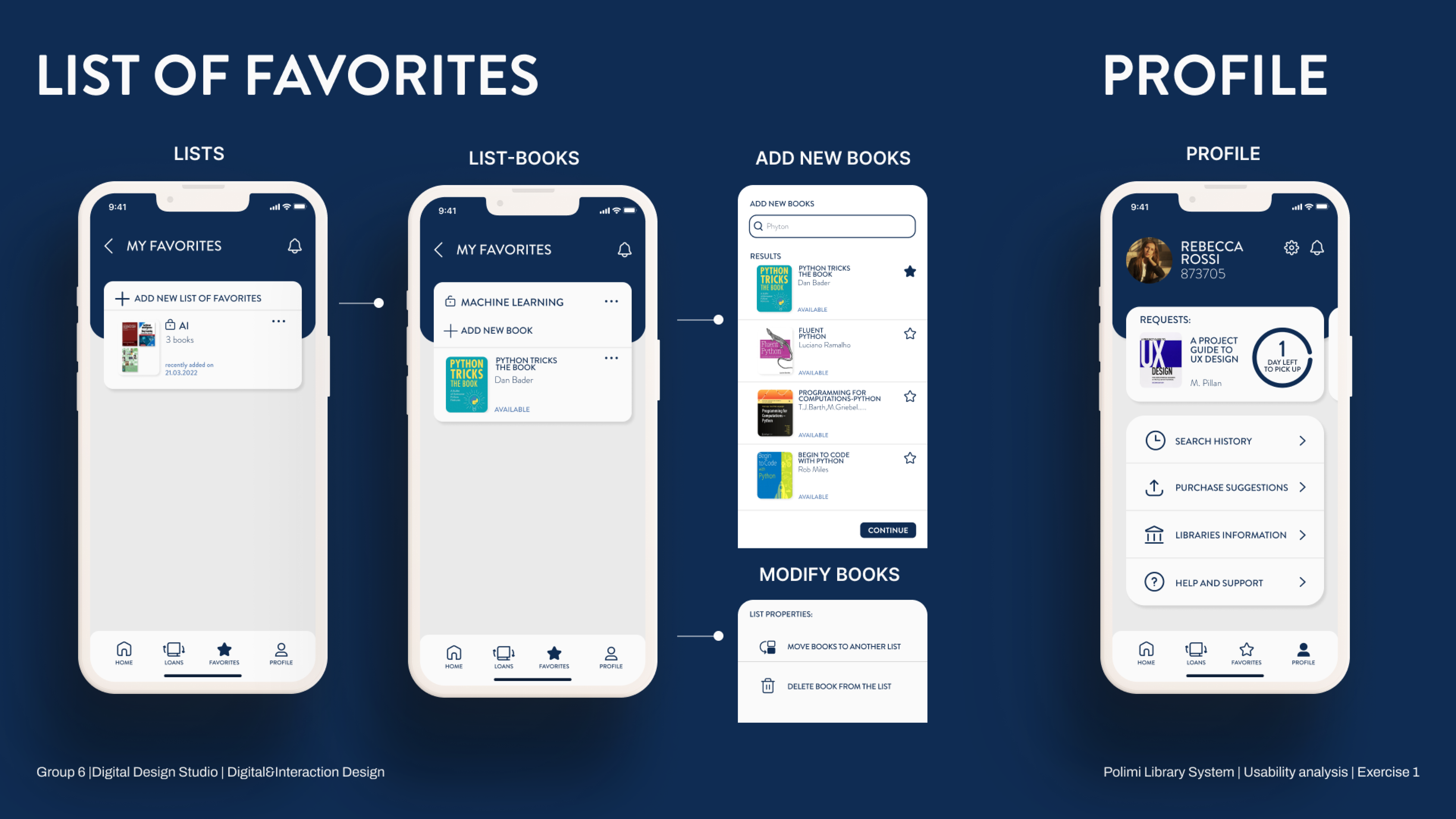
POLIMI LIBRARY was developed as part of the Digital Design Studio course at Politecnico di Milano. Our task began with conducting usability testing and analysis of the original app design. Once we gathered evaluation results, we initiated the redesign process. This project followed the UI/UX design methodology, starting with organizing the app’s information structure based on card sorting and tree testing results. From there, we developed wireframes and high-fidelity prototypes. At each stage of the design process, we performed user testing and analysis to ensure optimal results.
Analysis Phase
Methodology
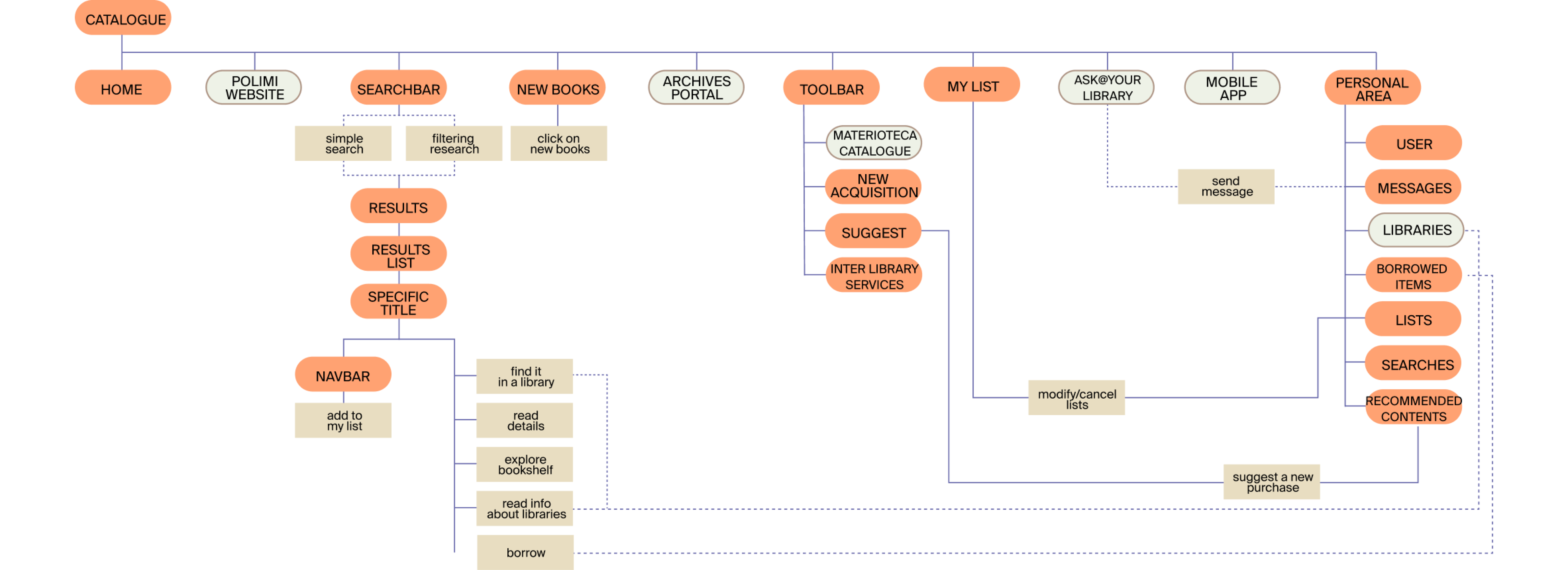
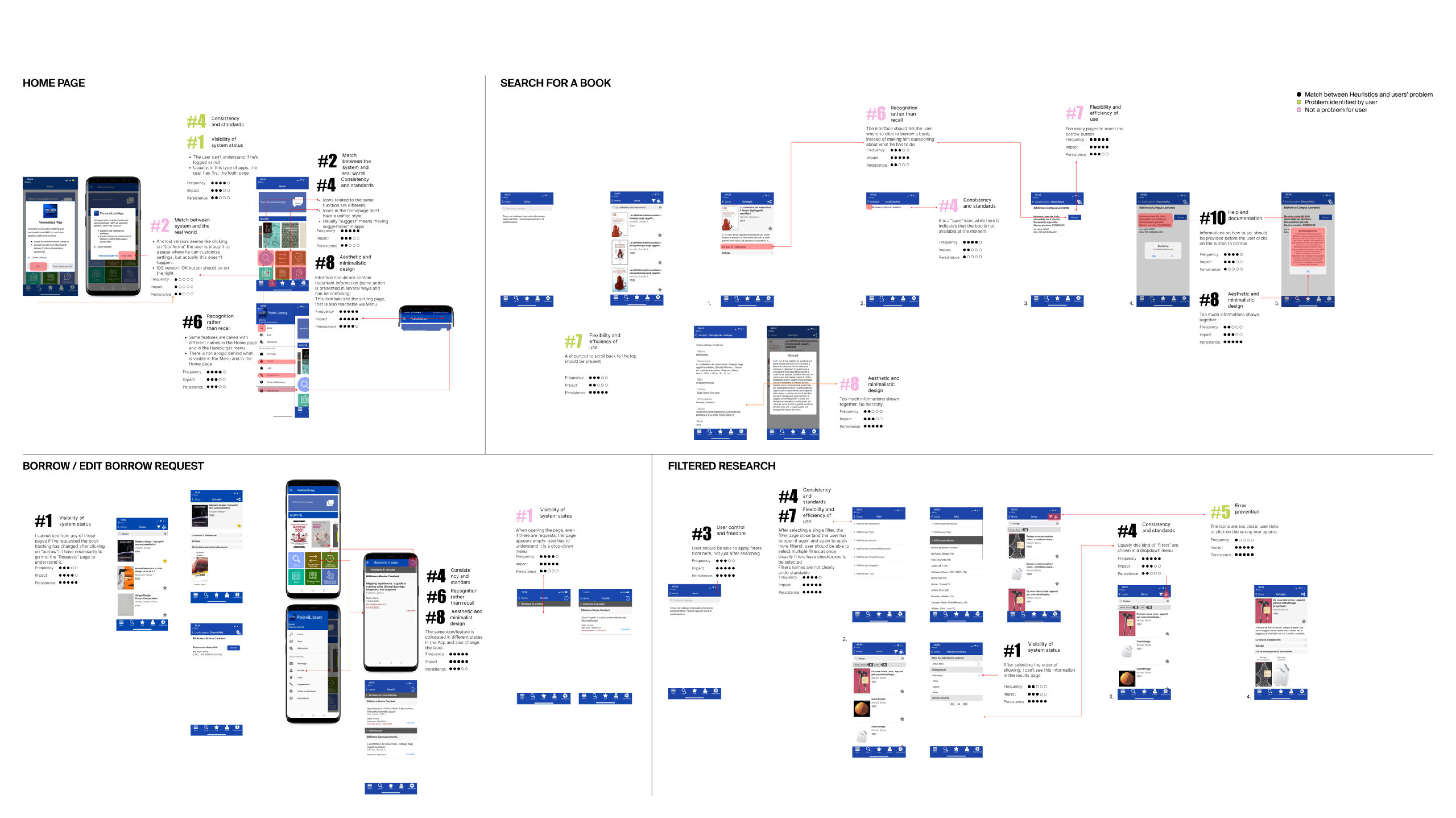
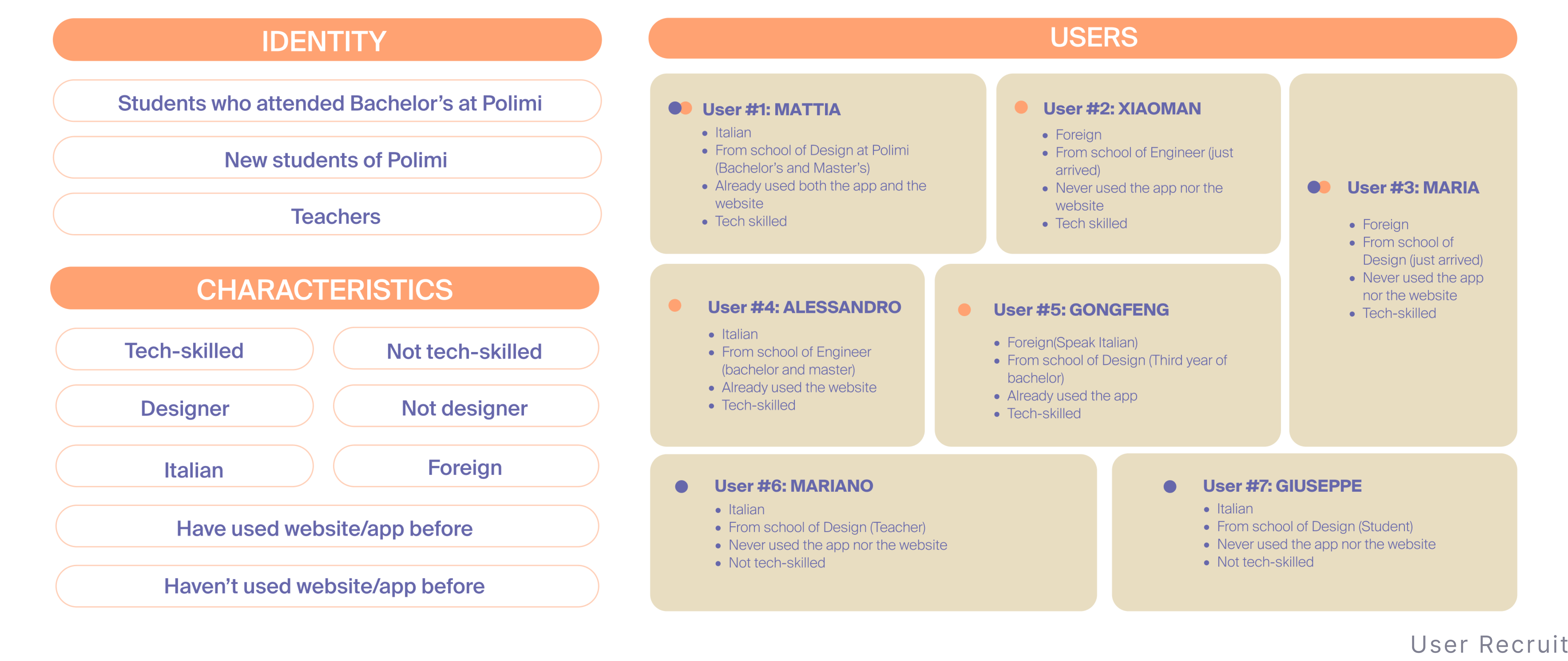
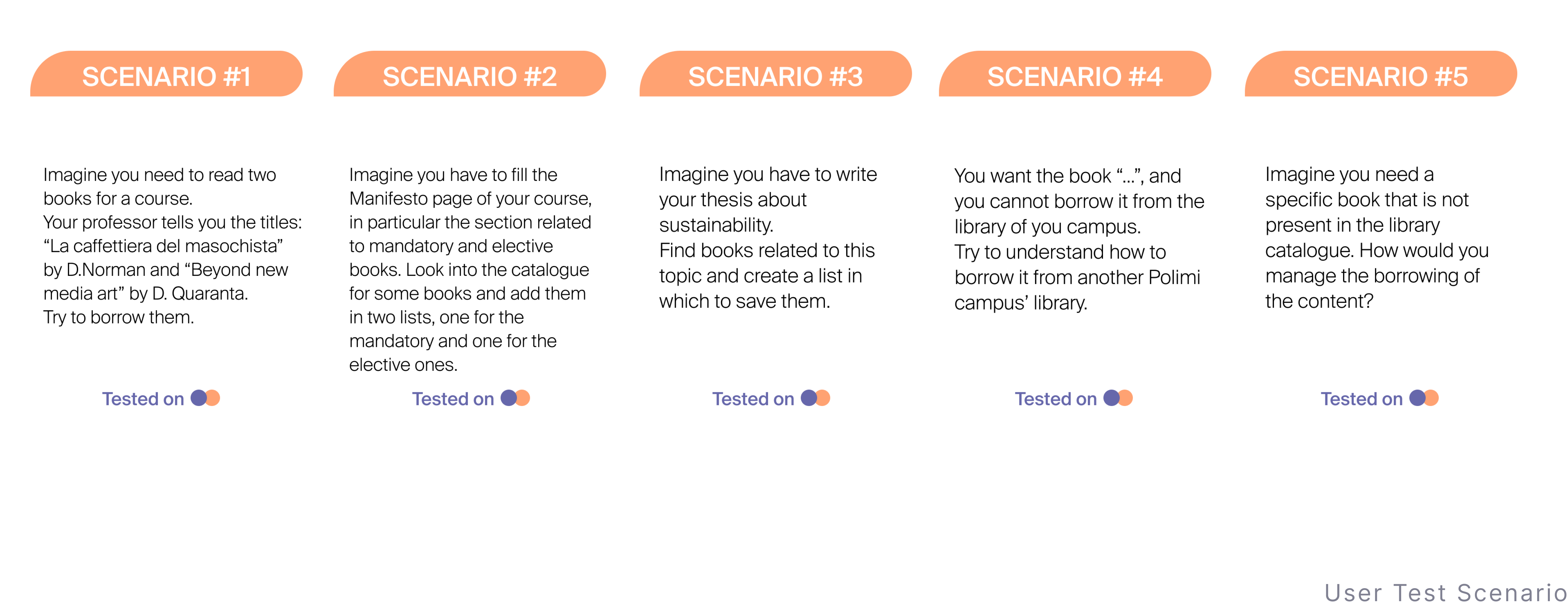
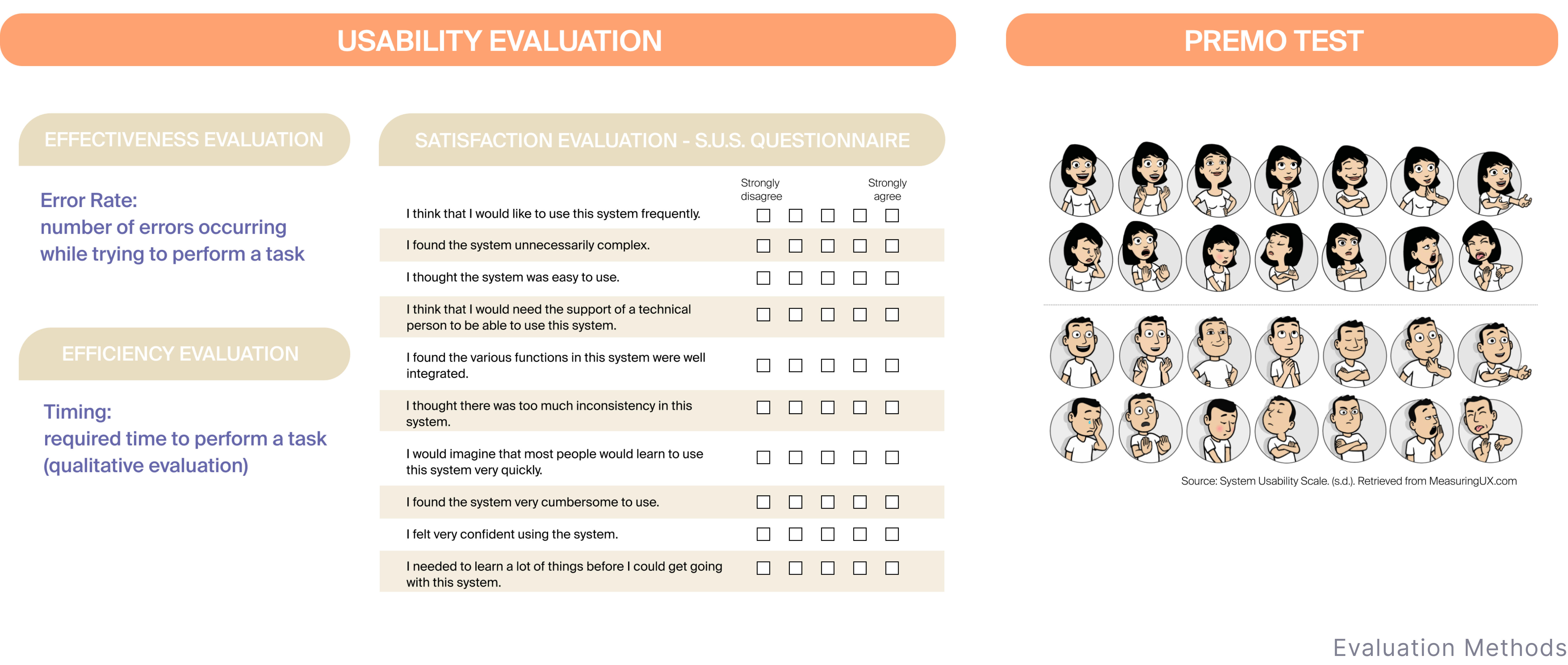
To analyze the original app-POLIMI LIBRARY, we initially created an information architecture to provide us with an overview of the app. We then identified the most crucial pages and conducted a heuristic evaluation, using the Nielsen 10 as our reference. Following the heuristic evaluation, we invited six users to participate in user testing. Finally, we analyzed the results from both our inspection as evaluators and from the users’ perspectives to prepare for the next step, which is redesigning the app.
Information Architecture Analysis
To analyze the original app-POLIMI LIBRARY, we initially created an information architecture to provide us with an overview of the app. We then identified the most crucial pages and conducted a heuristic evaluation, using the Nielsen 10 as our reference. Following the heuristic evaluation, we invited six users to participate in user testing. Finally, we analyzed the results from both our inspection as evaluators and from the users’ perspectives to prepare for the next step, which is redesigning the app.
Heuristic Evaluation
User Test
Redesign Phase
Methodology
Considering as a starting points the key findings and recommendations in the previous stage, and in order to validate the proposed redeisgn solution, we applied several UX tools as to maintain the focus on a user-centered design approach. Users were actually involved in each step of the redesign activity.
Information Architecture Creation
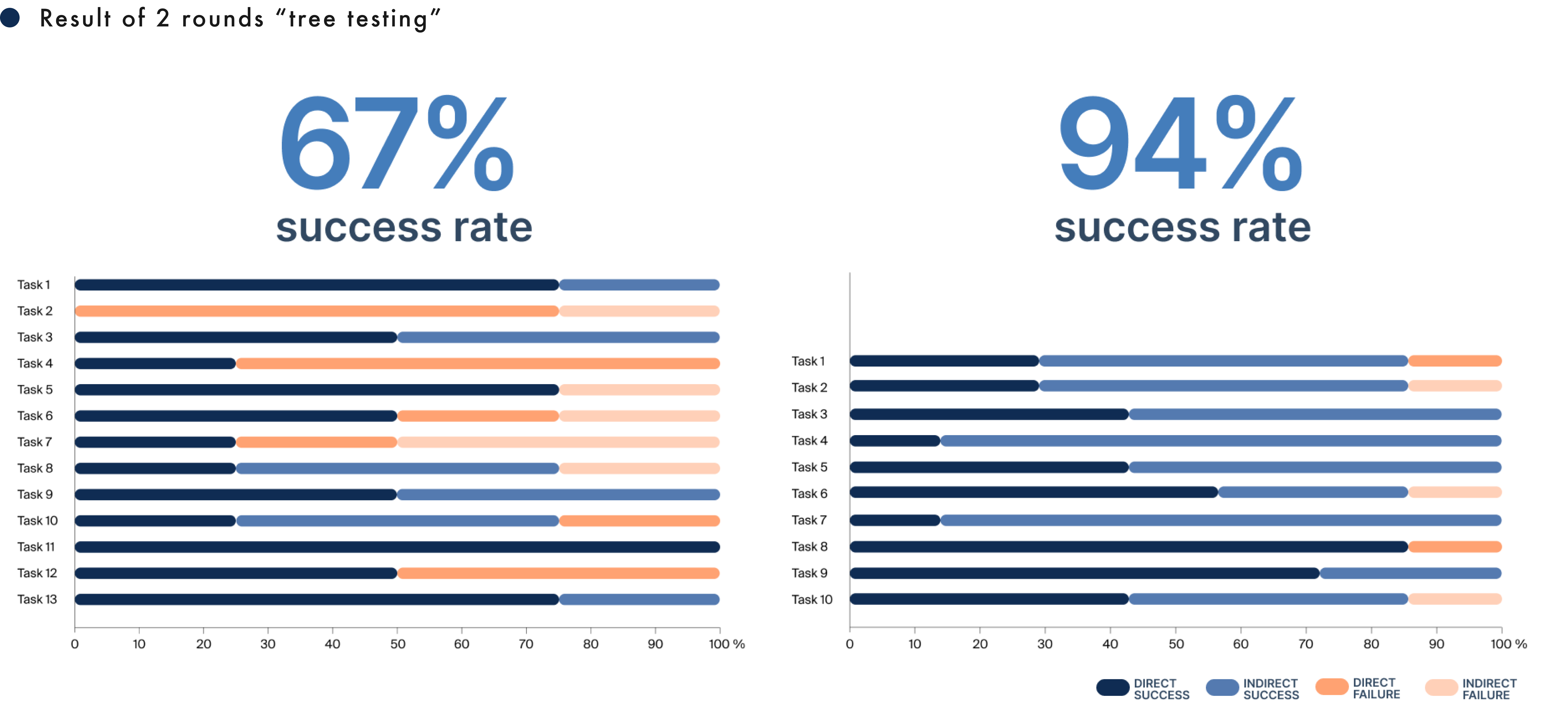
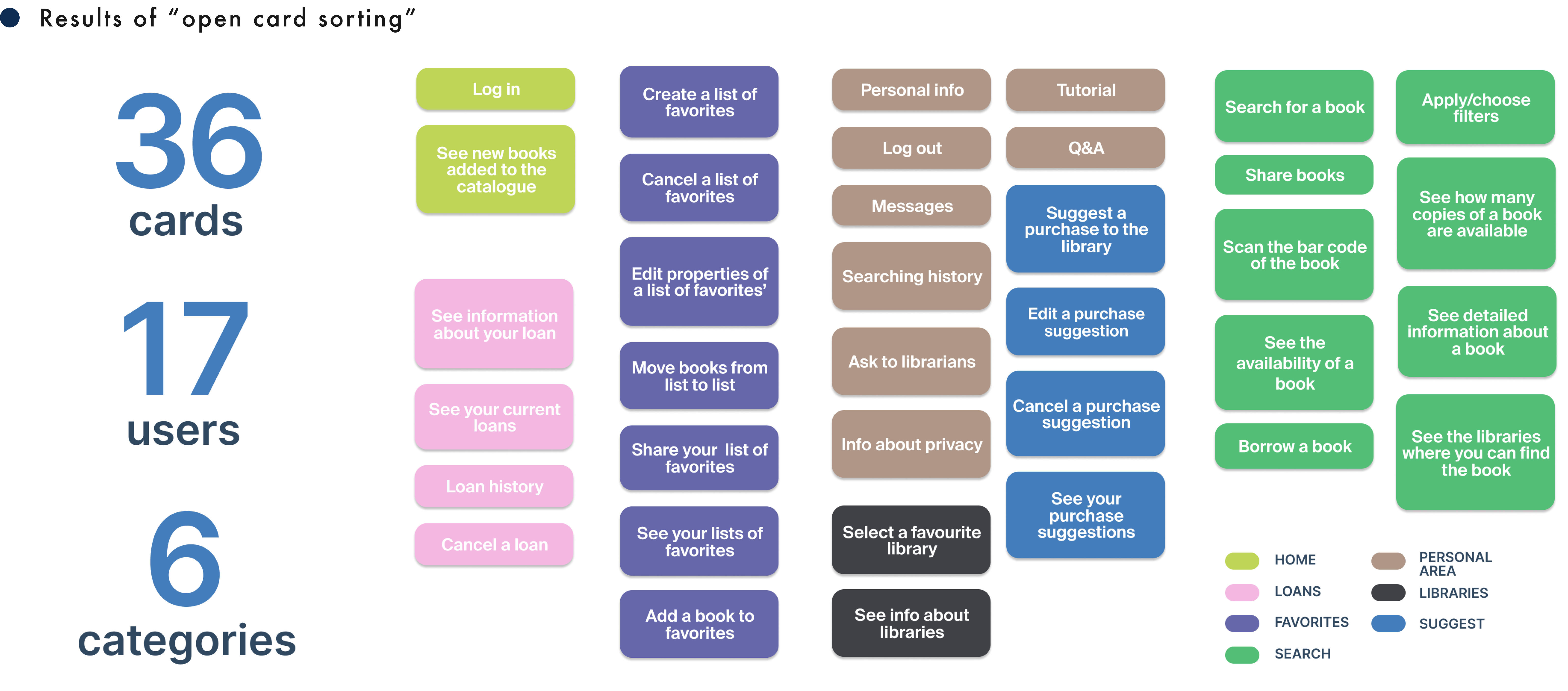
As first step, we used “open card sorting” method and “tree testing” method to obtain insights about users’ mental models, especially related to process when we created the new information architecture. To confirmed the final information architecture, we produced 4 version according to the results from both UX tools.

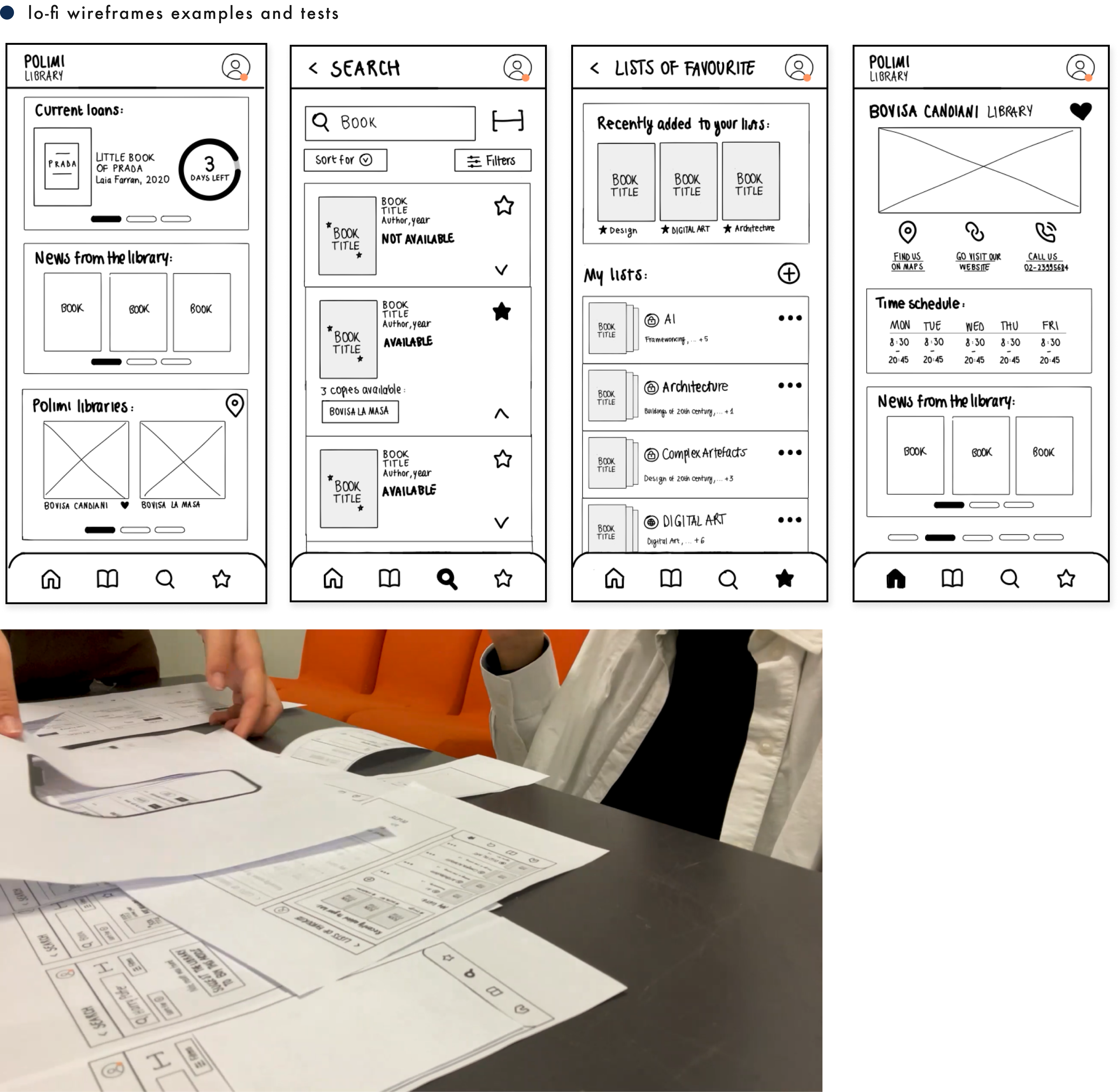
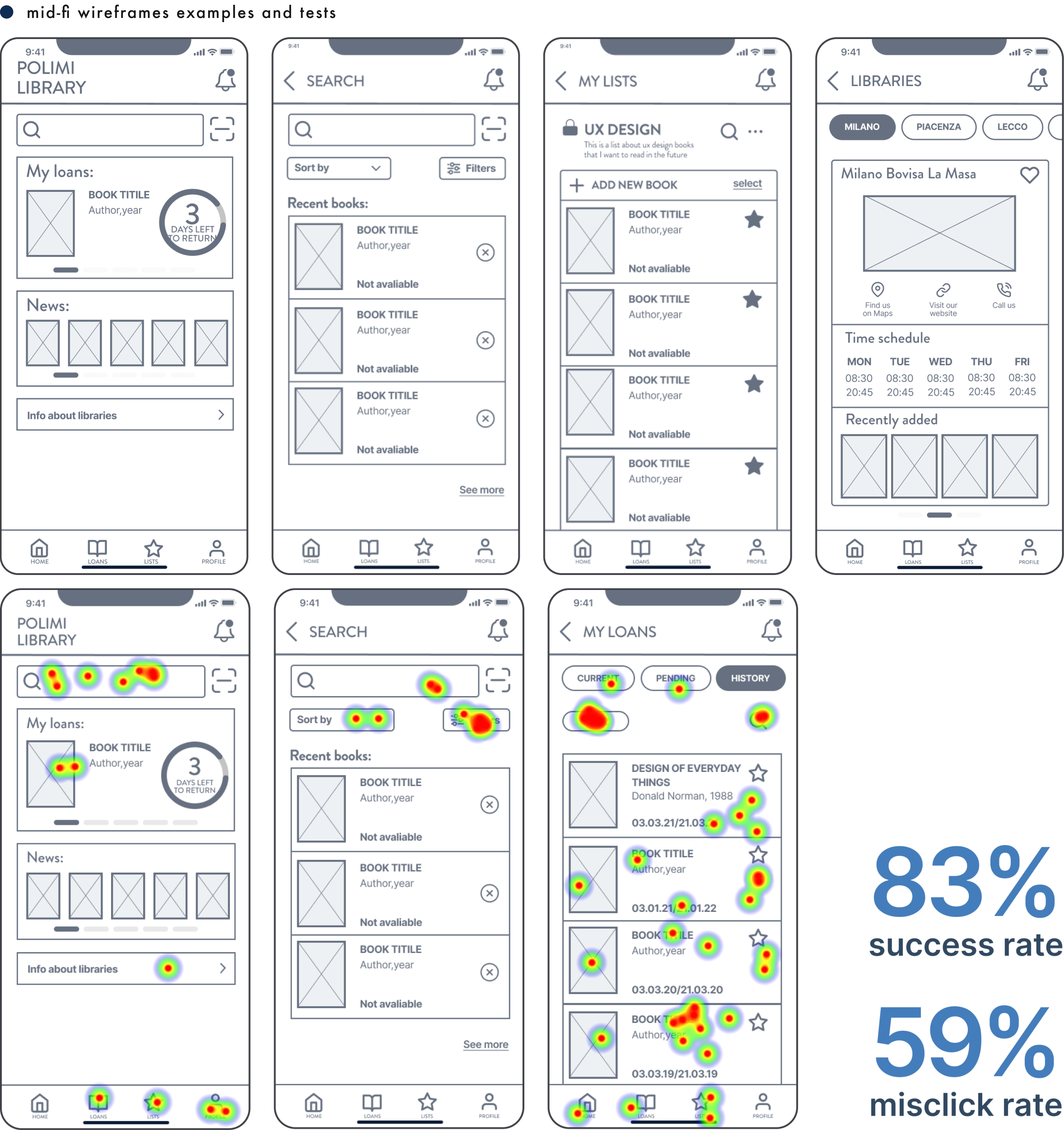
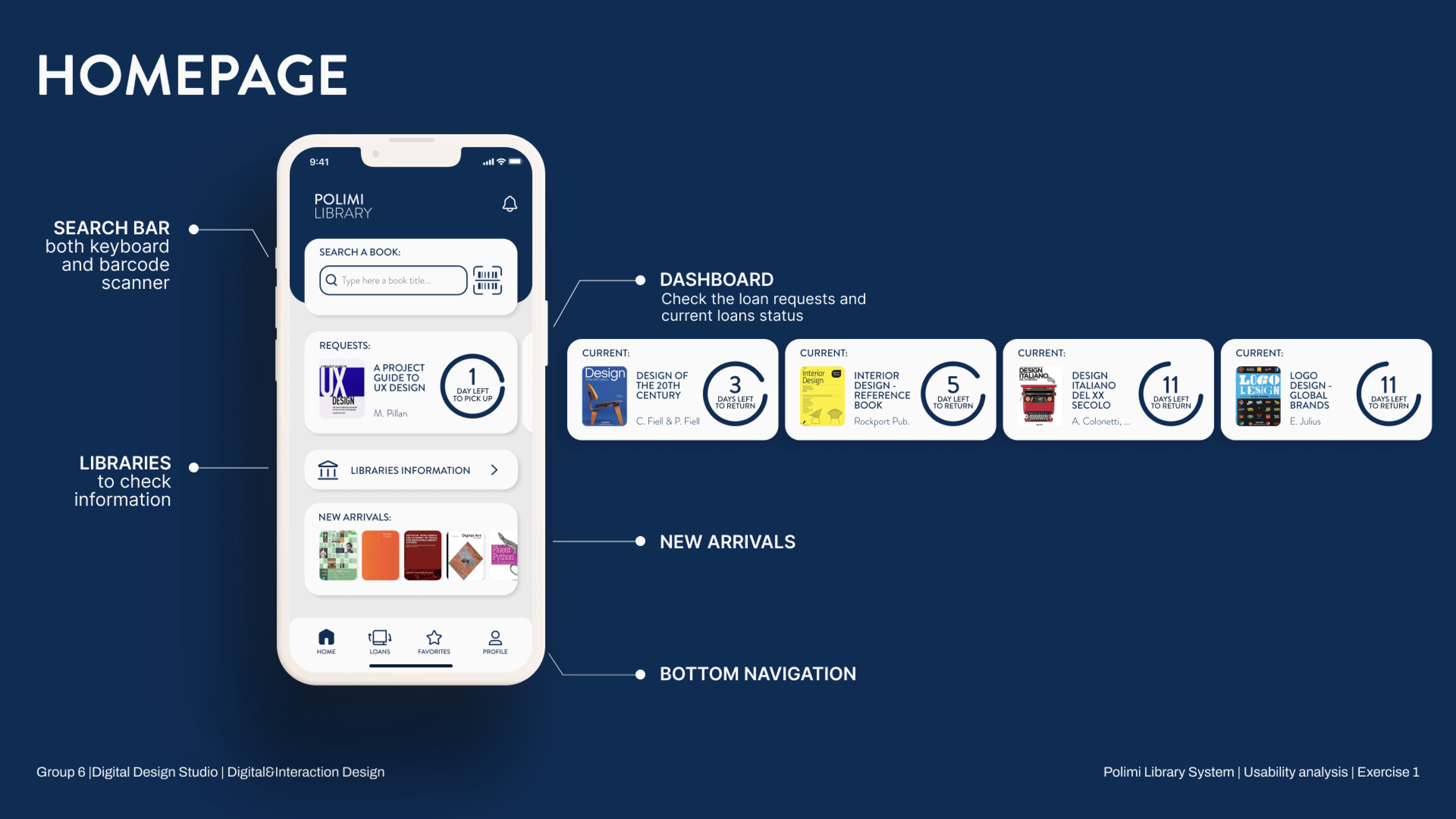
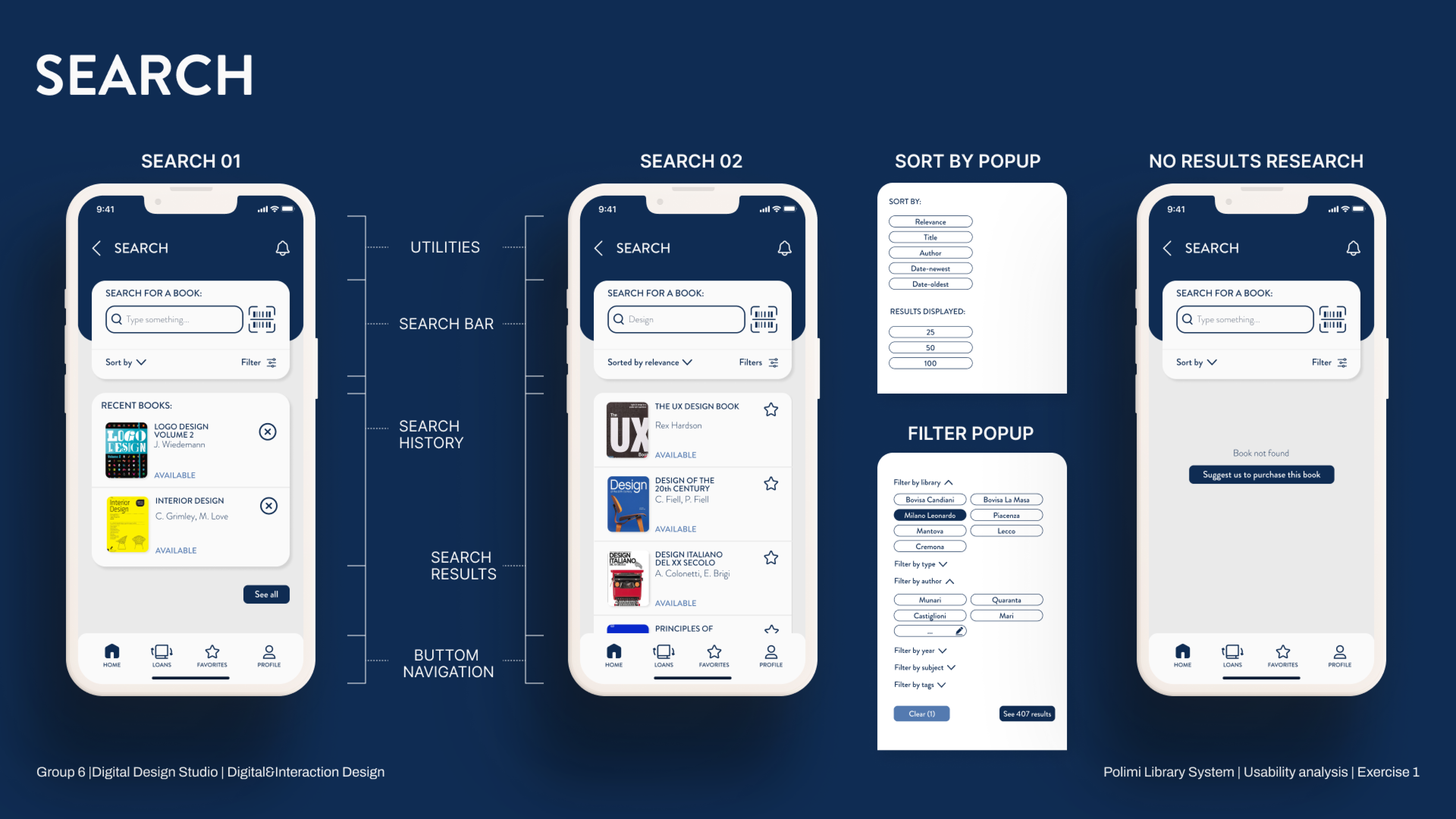
Wireframe design from lo-fi to hi-fi
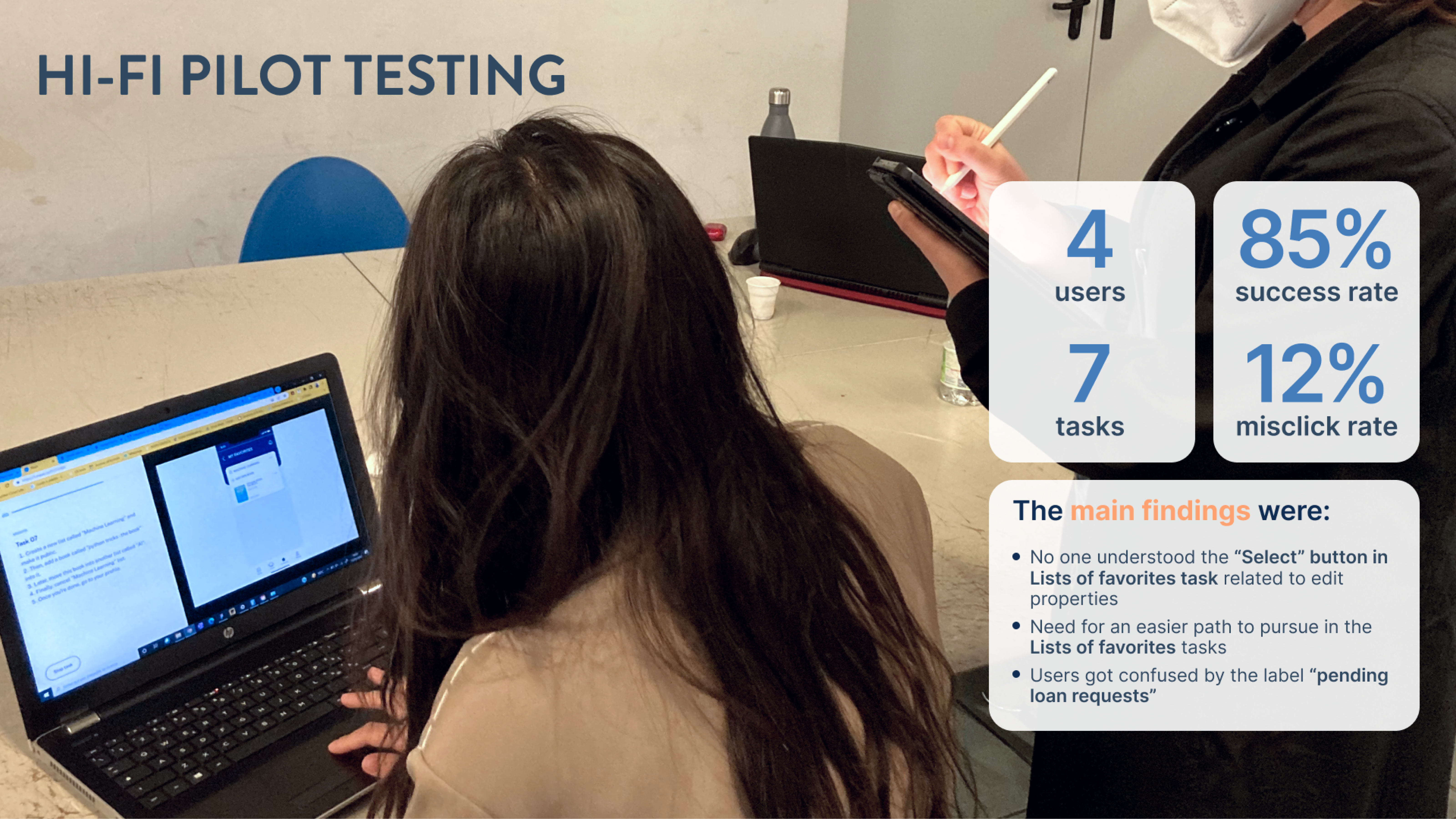
As next step, we translated the information Architecture into wireframes, as to test both the hierarchy of information and the smoothness of interaction. This process was also carried out with the use of heatmaps, clicks counting and success rate of tasks performance.

Design System
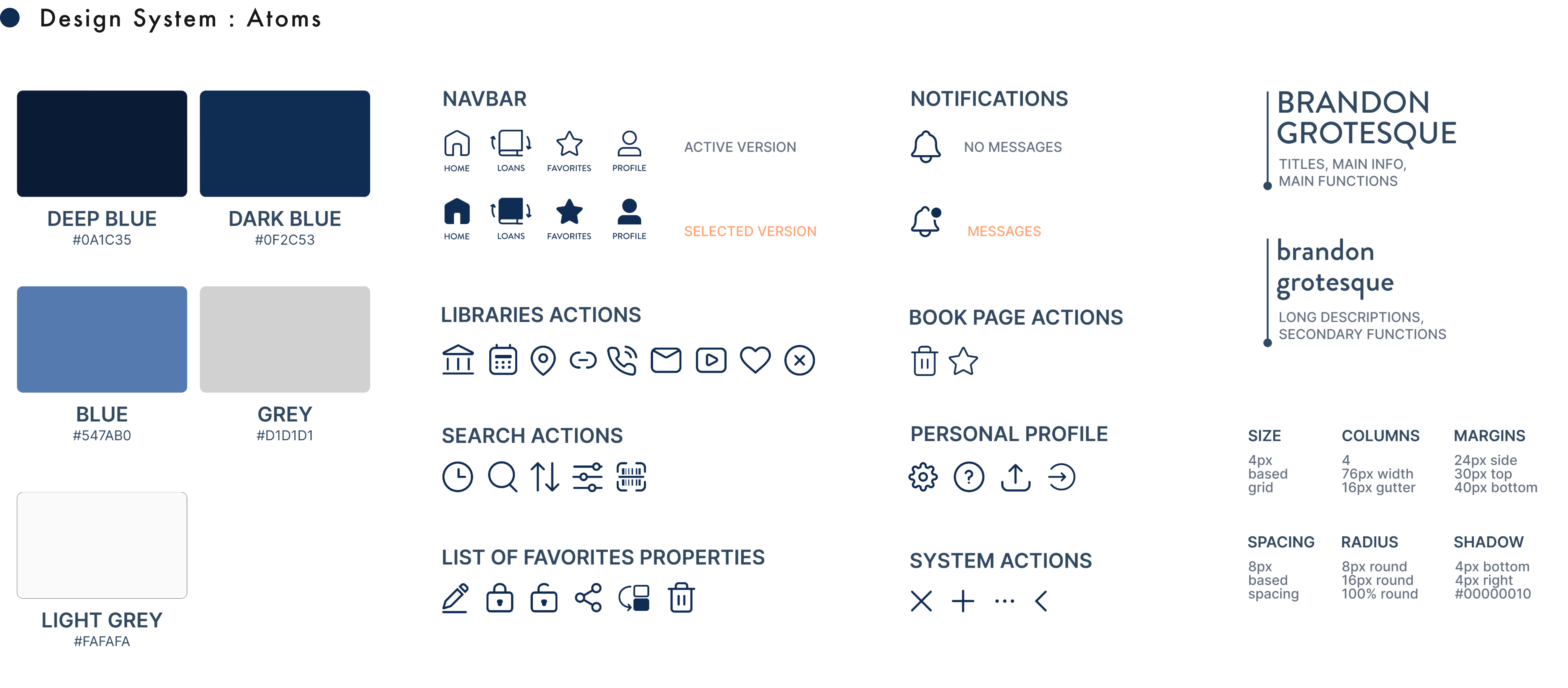
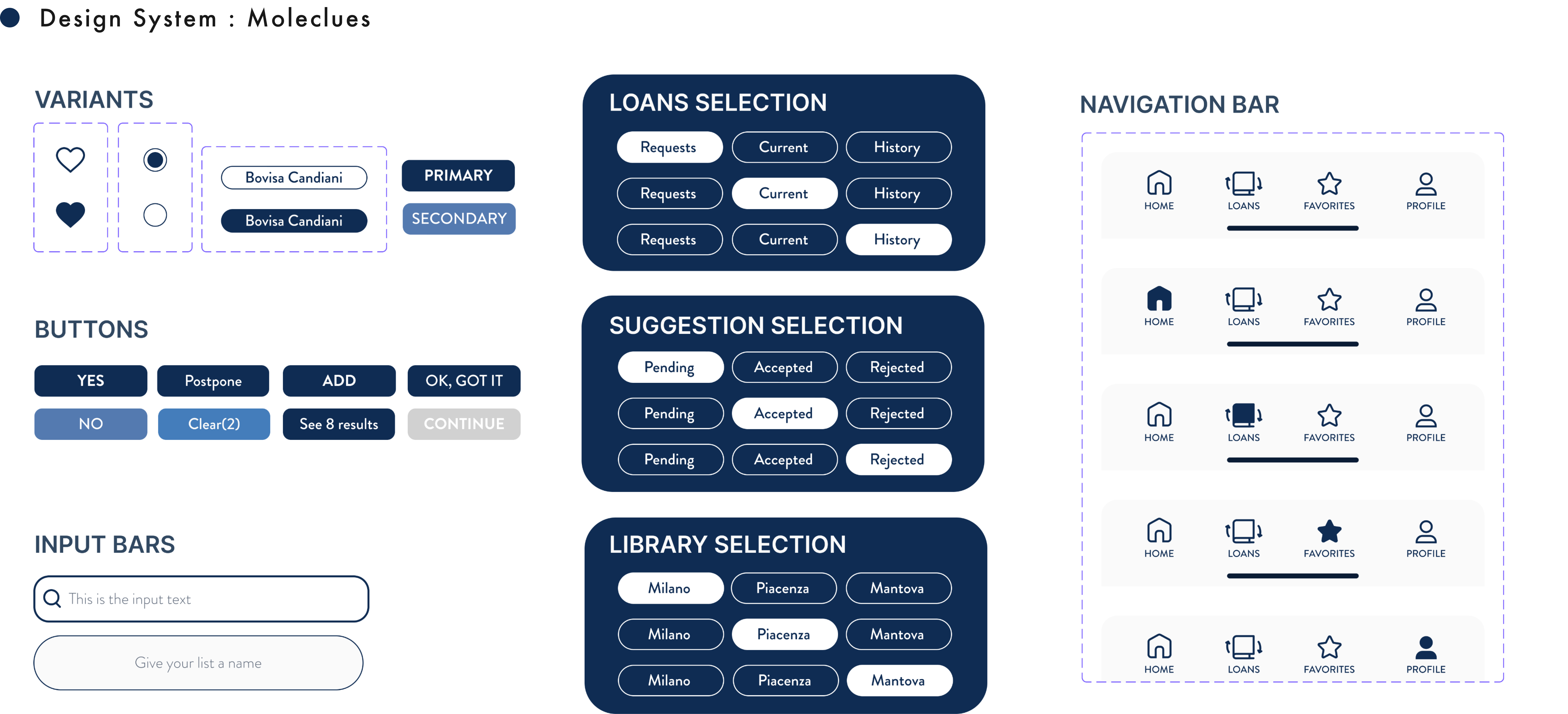
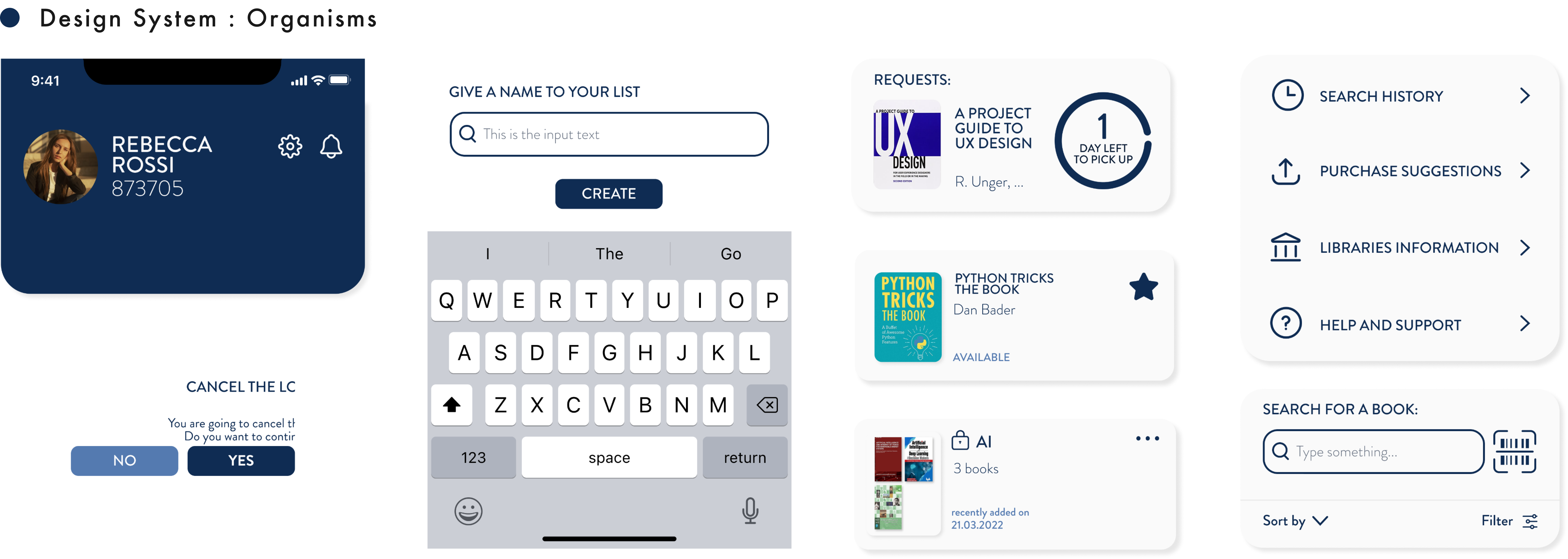
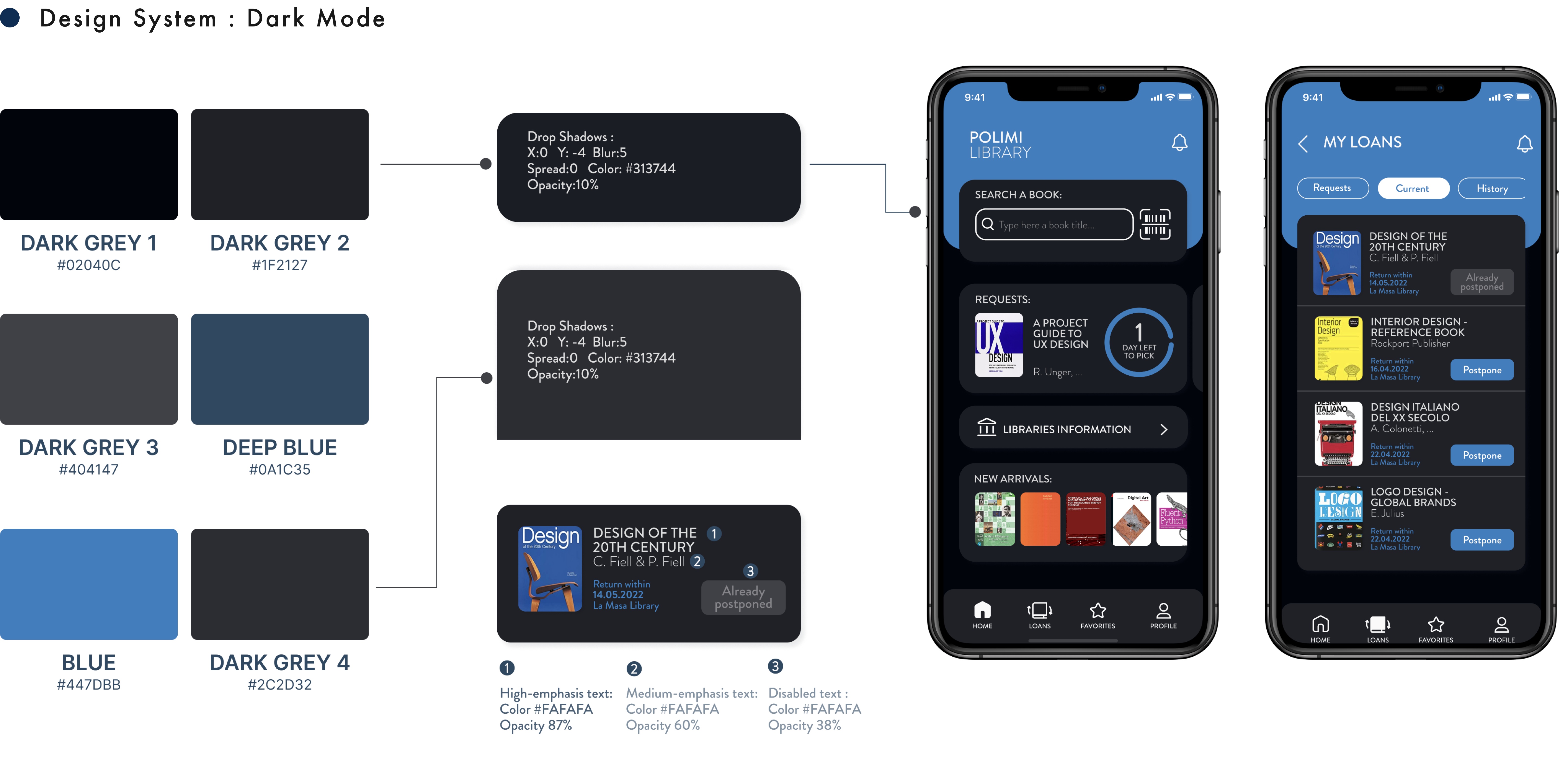
UI Prototype
Team Members
Carlotta Castenetto
Xiyuan Hu
Federica Sciretta
Letizia Bianchini