Dashboard for Cycling facilities planning
Type
Year
Key Words
Design In University
2022
UI/UX Dashboard Data Visualization
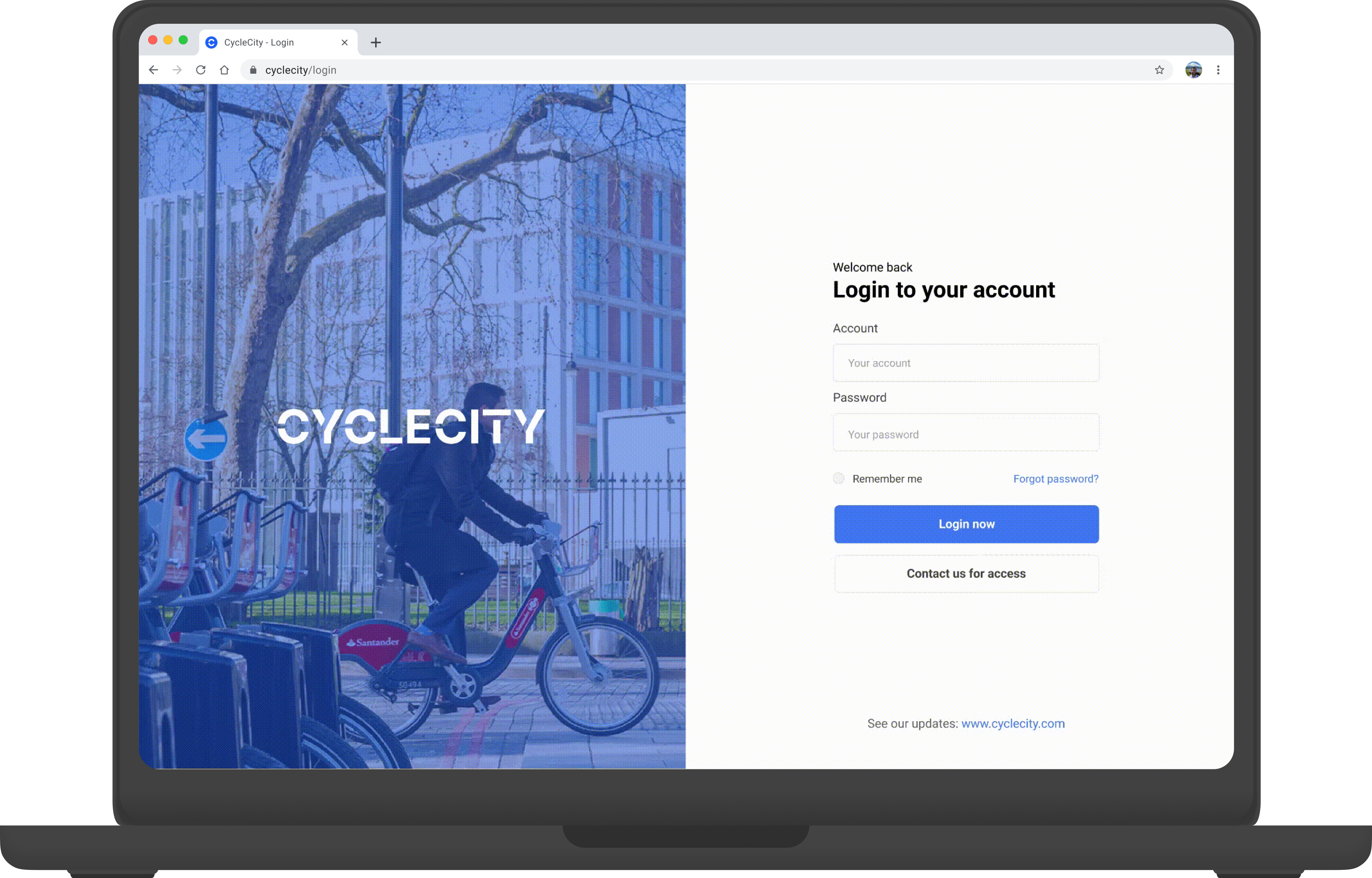
Dashboard for Cycling facilities planning
CYCLECIT is a dashboard designed to assist stakeholders such as public transport companies and municipalities in enhancing the city’s cycling rate. It offers features like monitoring cycling rates and planning new cycle lanes or facilities based on the specific conditions of different areas.

I completed CYCLECITY during my ENVISIONING AI THROUGH DESIGN studio at Politecnico di Milano. The course taught us how to work with data and AI models to create dashboard designs. I played a major role in exploring the AI model, creating wireframes, and contributing to the UI design.a
Abour the course...
Each group was assigned a stakeholder, and ours was a public transport company. Our goal was to identify the problems and opportunities that arose during the pandemic and propose a dashboard solution with embodied AI system to the company’s manager.
Given the accessibility of the database and research, our team chose London as our target city and Transport for London (TFL) as our specific company. The manager of TFL served as our stakeholder.
How Might We
Help TFL leverage the pandemic as an opportunity to increase cycling and promote sustainable transportation?
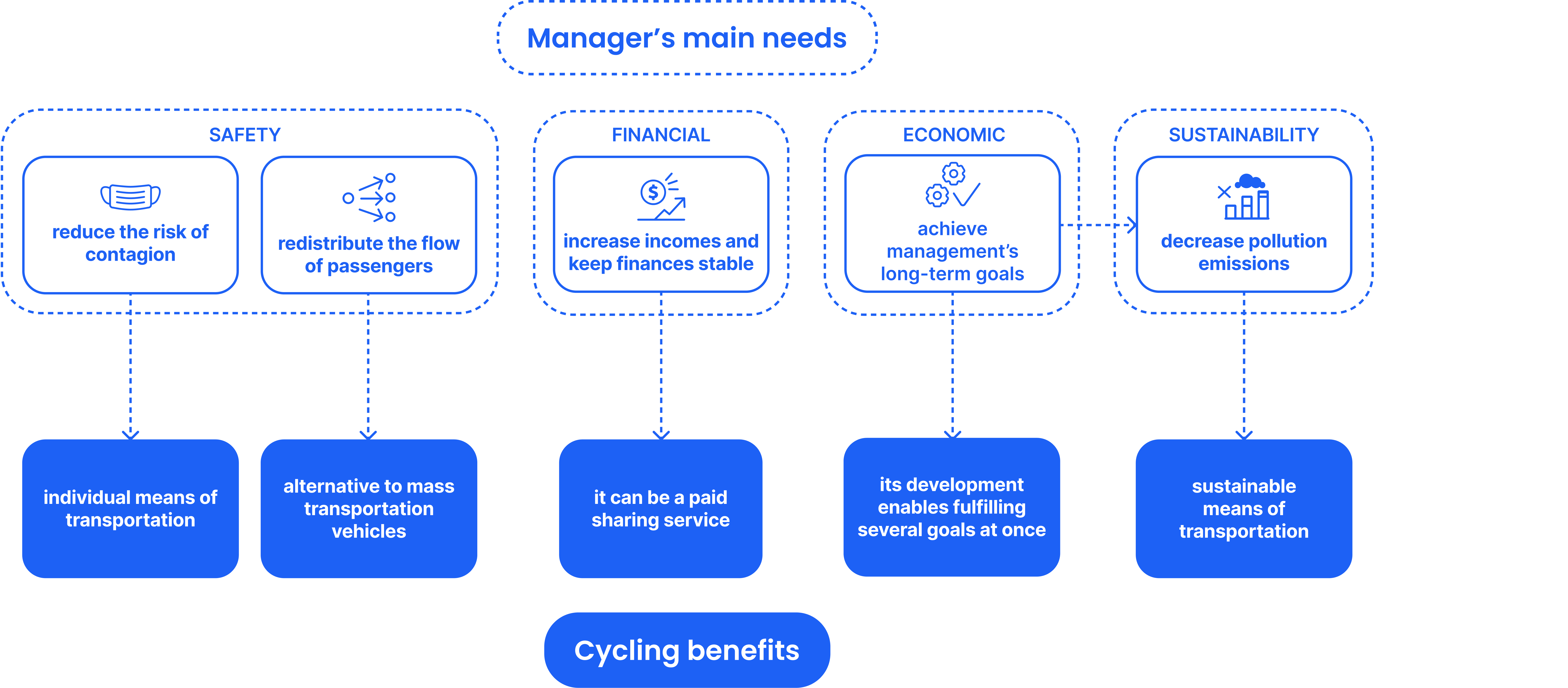
Value Proposition
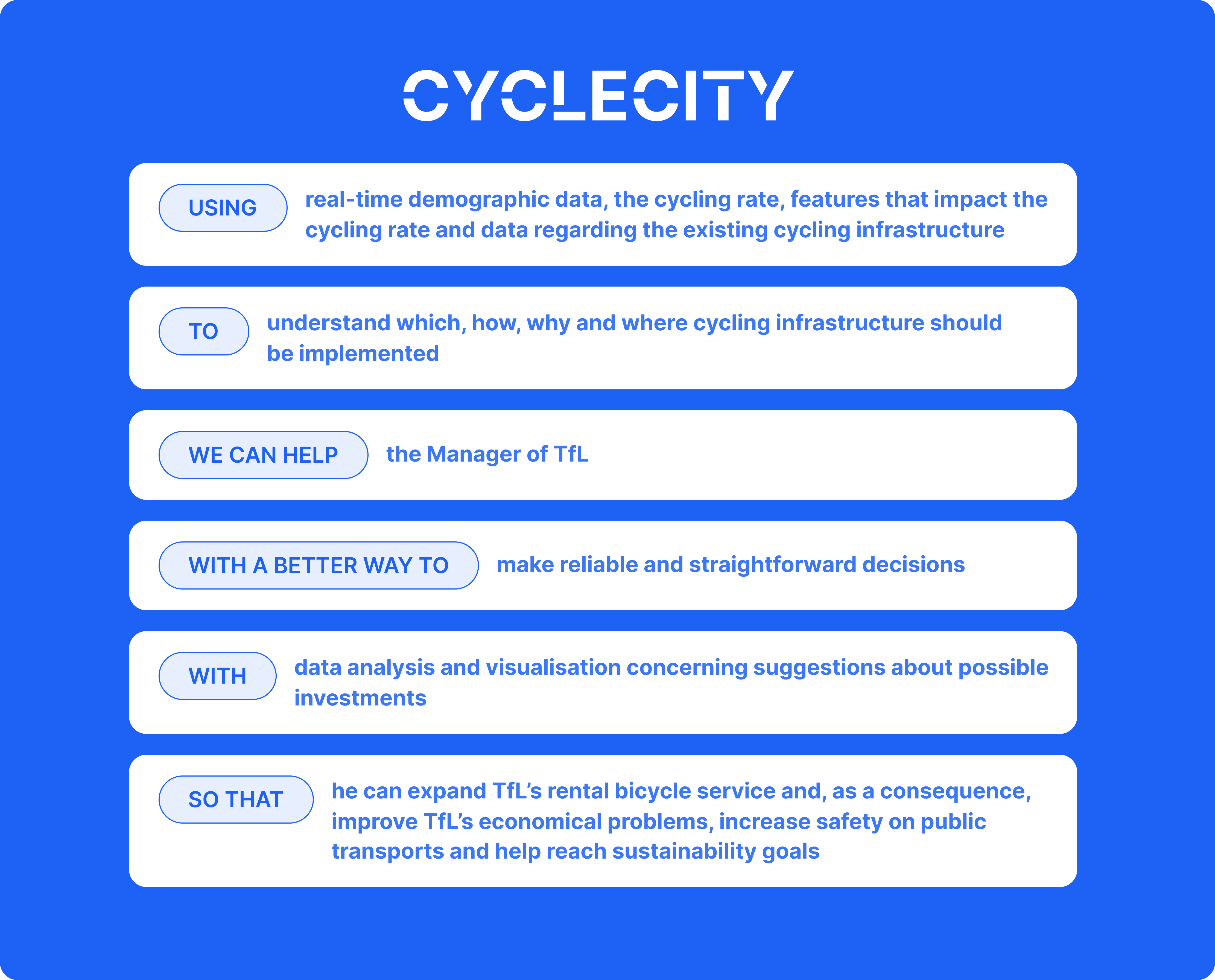
Dashboard Design
Methodology
Based on the insights from the research on TfL and its manager, we applied User Stories to interpret the core functionality of the software, as a way to clarify how the software features provide value to the client. Through the User Stories, we iterated and defined the information architecture and applied Scrum and Agile approach to break the development process into 5 sprints based on the user stories and the new information architecture. For each Sprint, concepts are developed and iterated through a process of Benchmarking – Wireframing – Peer Reviewing & A/B Testing.
User Stories
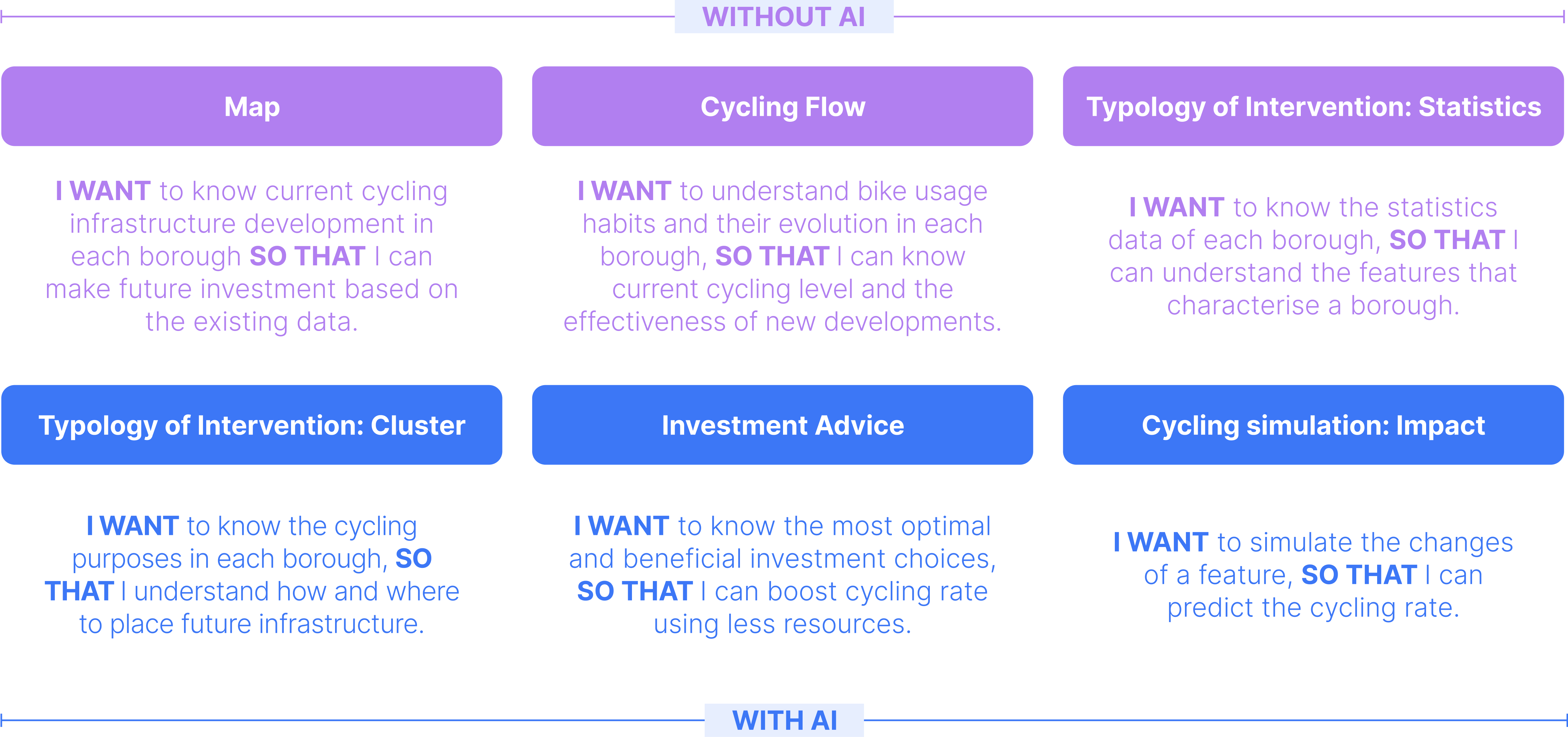
In the user story, we describe two main areas of interaction that users can have with the dashboard: one without AI involvement, i.e. visualizing the underlying data to understand the current status of different zones, and the other with AI involvement, i.e. clustering the underlying data and analyzing its impact to give users investment recommendations.
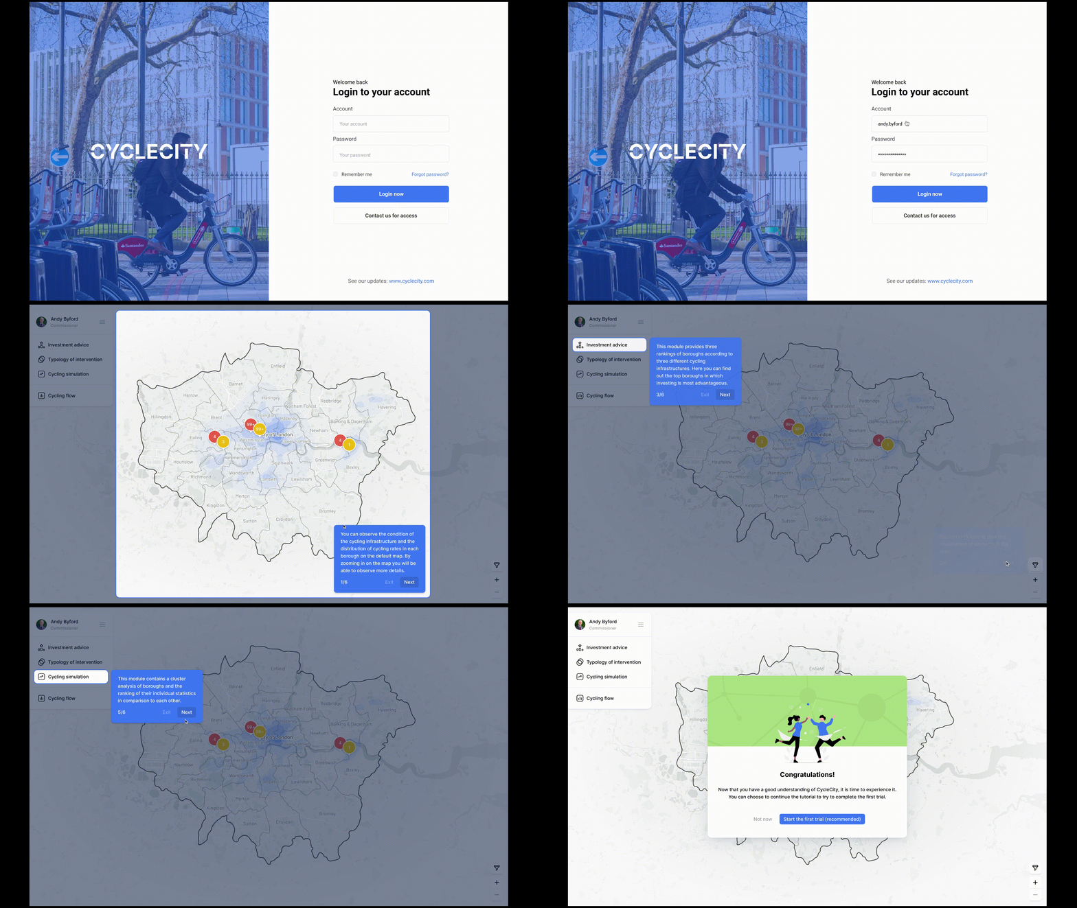
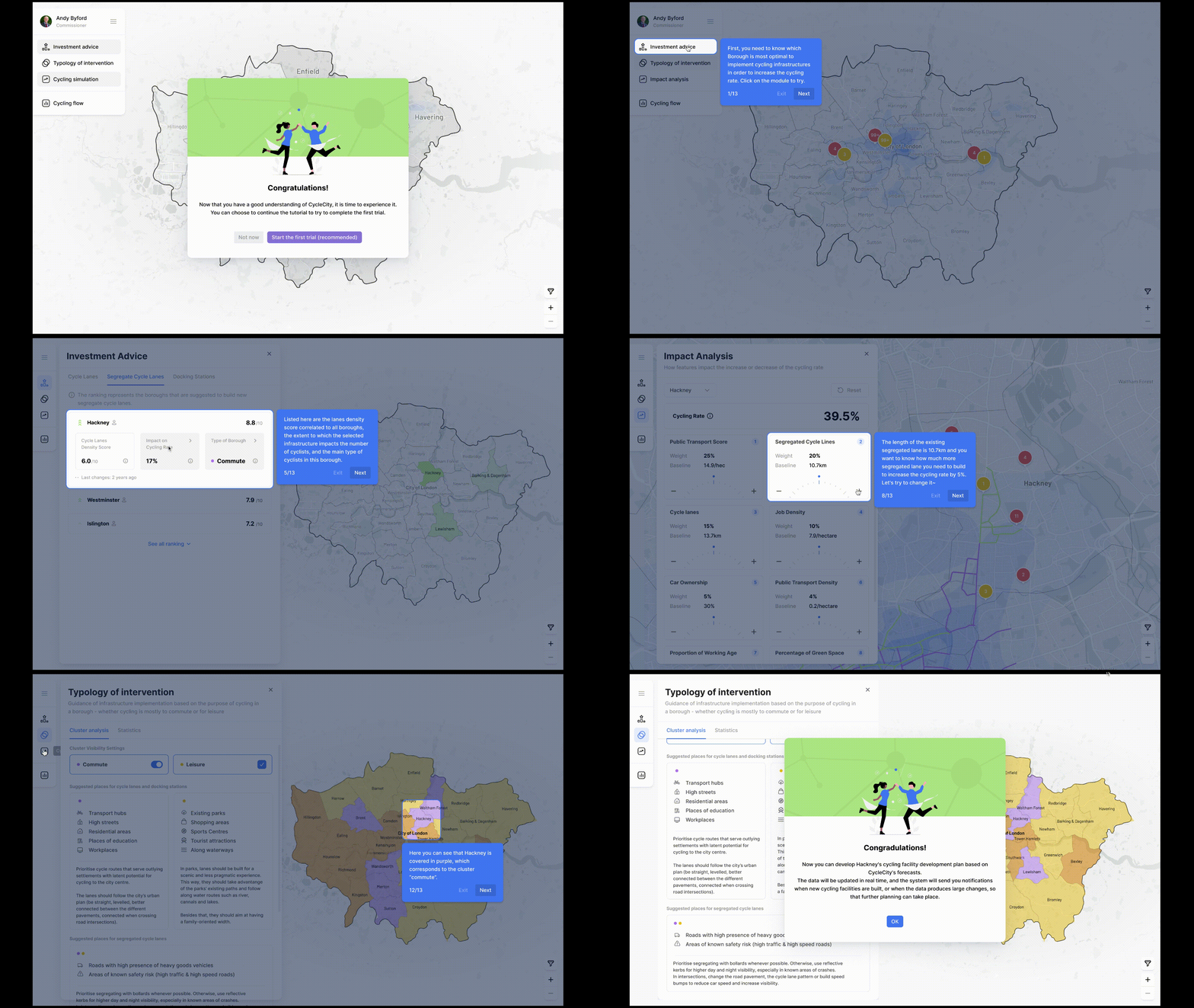
1. On boarding
I WANT to be guided to use the dashboard for the first time
SO THAT I can understand the first and following actions to take in the dashboard
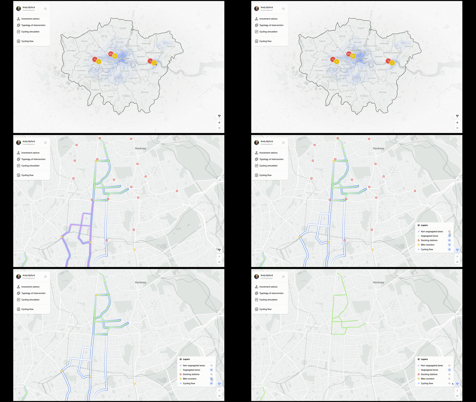
2. Map
I WANT to know current cycling infrastructure development in each borough
SO THAT I can make future investment based on the existing data.
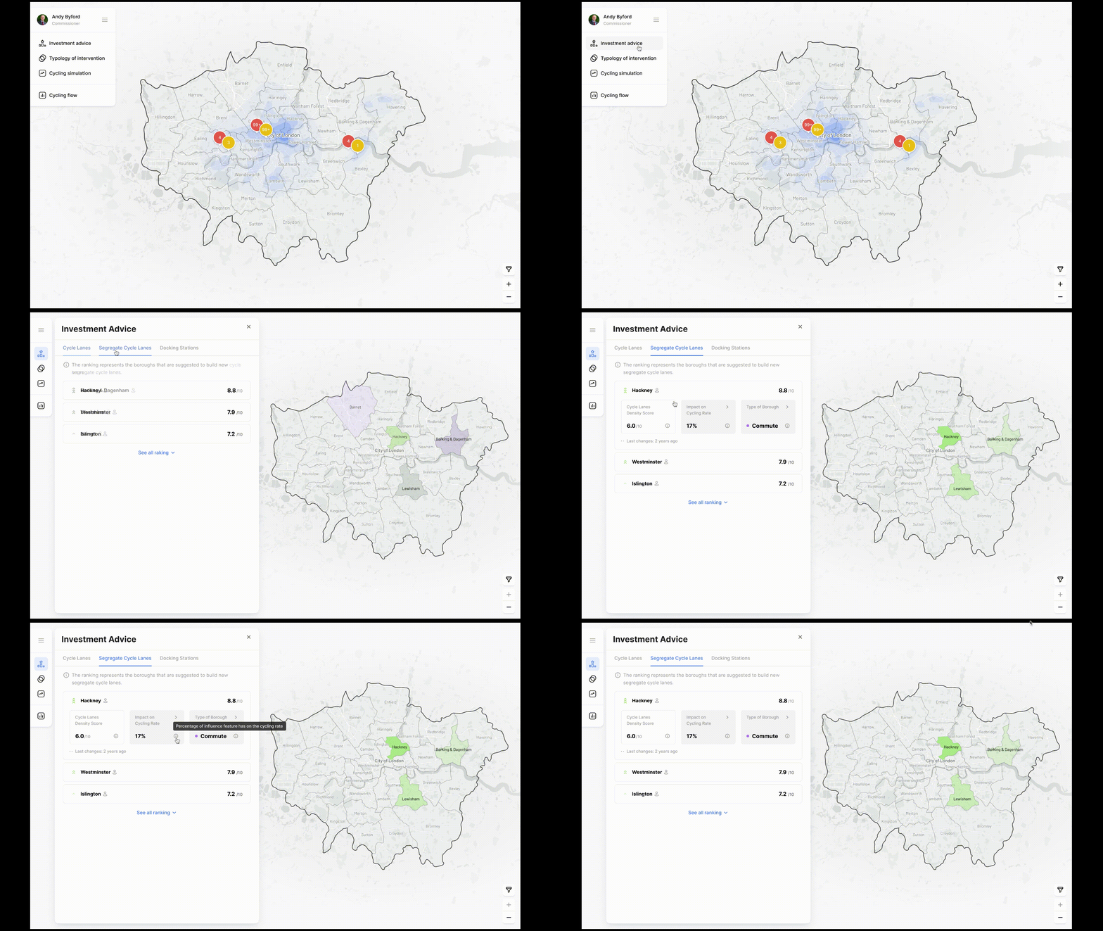
3. Investment advice
I WANT to be guided to use the dashboard for the first time
SO THAT I can understand the first and following actions to take in the dashboard
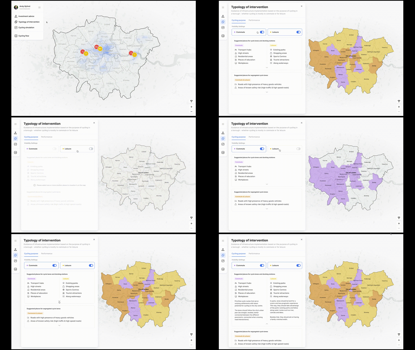
4. Typology of Intervention: Cluster
I WANT to know the cycling purposes in each borough
SO THAT I understand how and where to place future infrastructure.
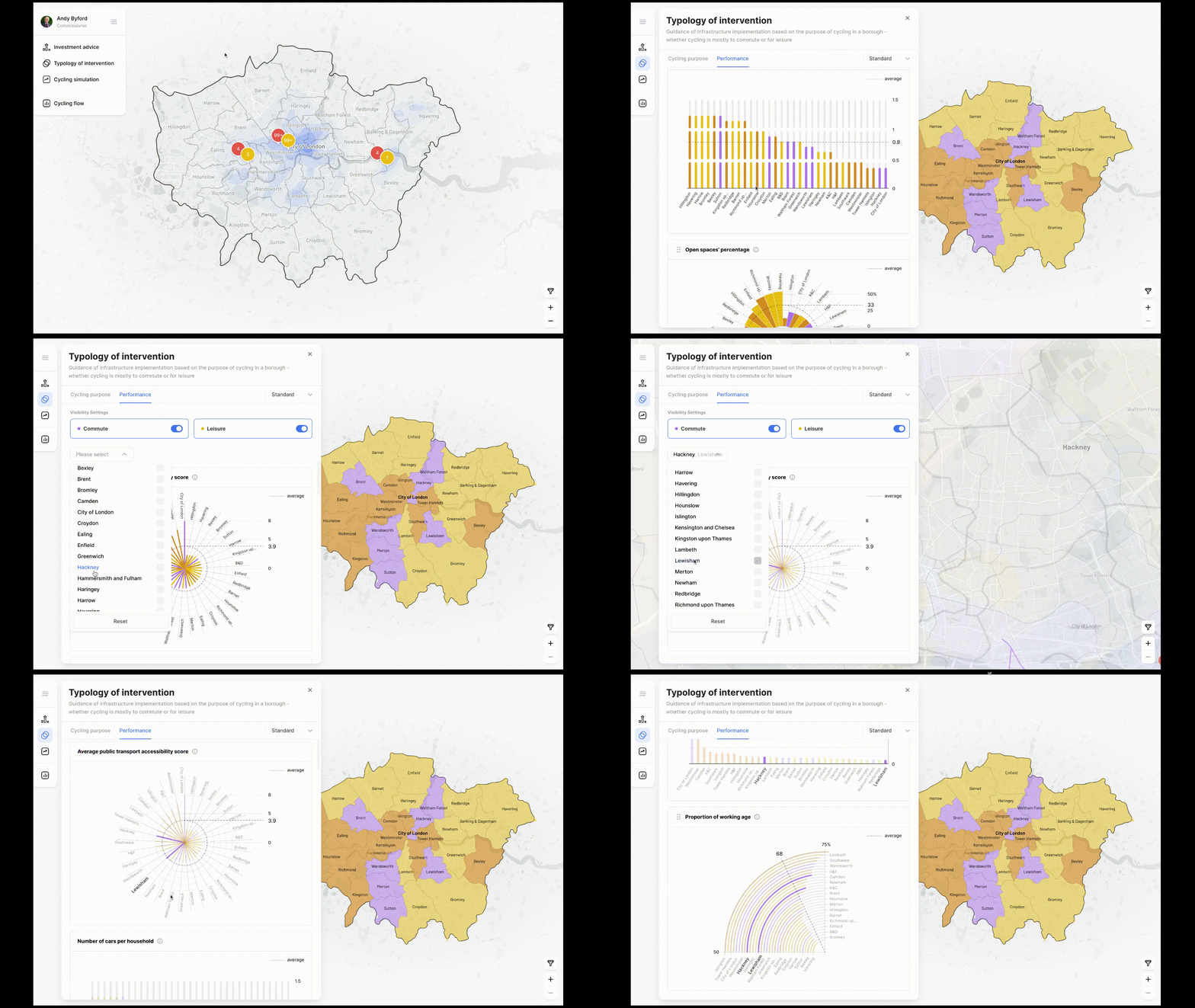
5. Typology of Intervention: Statistics
I WANT to know the statistics data of each borough
SO THAT I can understand the features that characterize a borough.
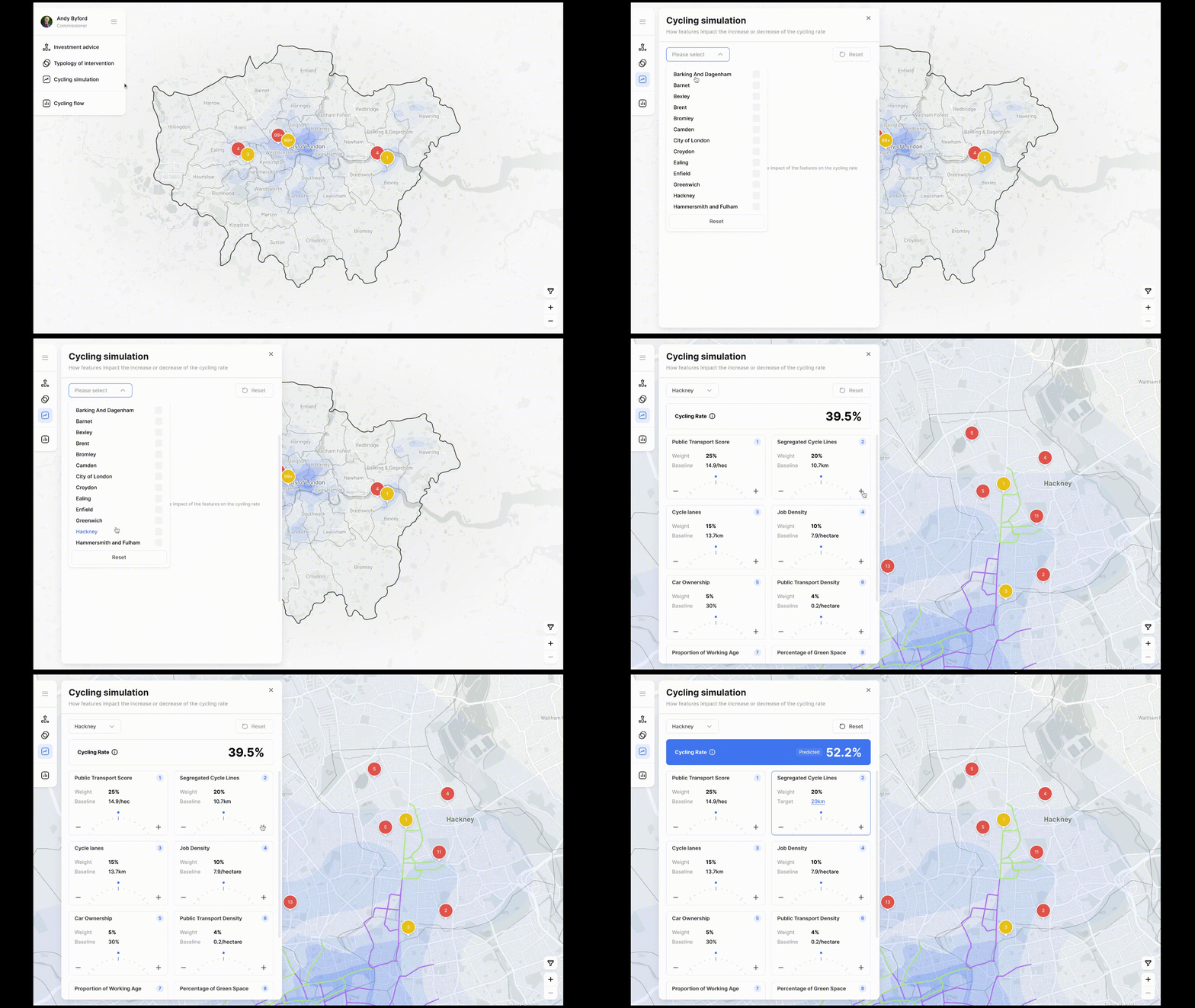
6. Cycling simulation: Impact
I WANT to simulate the changes of a feature
SO THAT I can predict the cycling rate.
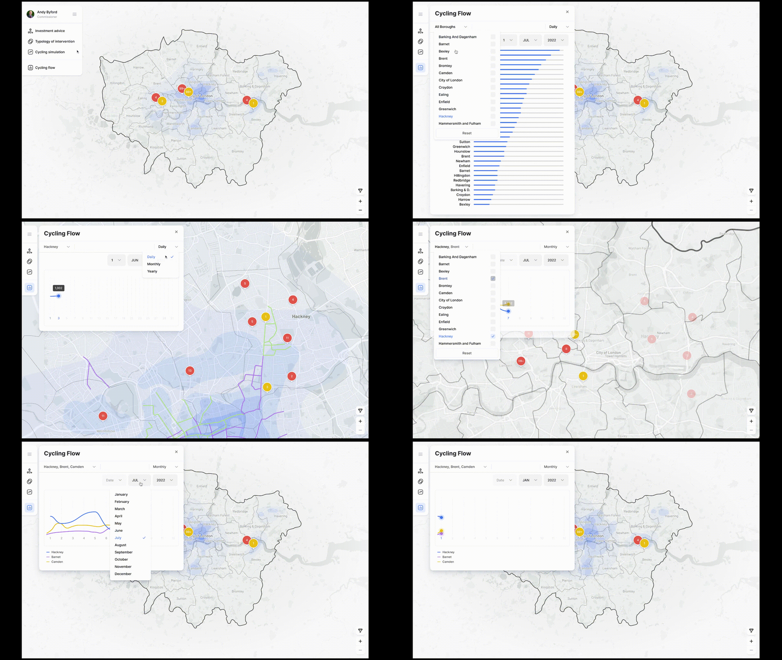
7. Cycling Flow
I WANT to understand bike usage habits and their evolution in each borough
SO THAT I can know current cycling level and the effectiveness of new developments.
Team Members
Virginia Arnaboldi
Xiyuan Hu
Miguel Barata
Rebecca Mazzoni
Wenbo Yang