Productivity and Wellness System
Type
Year
Key Words
Design In University
2024
UI/UX Generative AI Research
Productivity and Wellness System
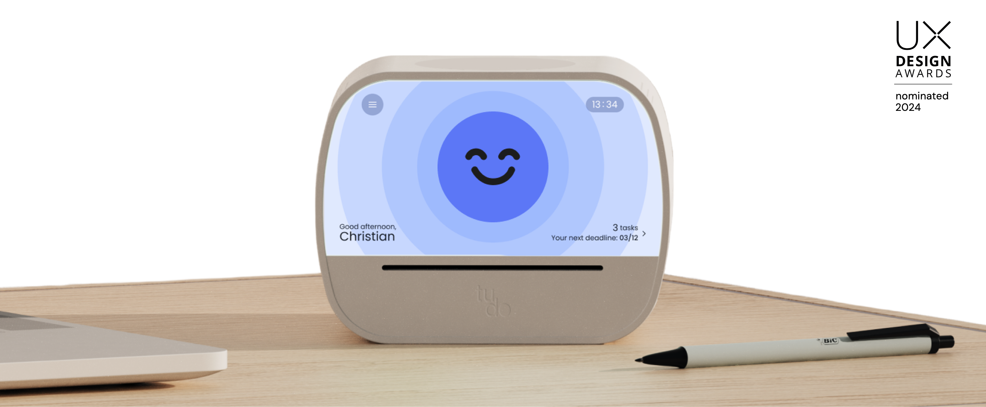
TUDO is an intelligent and personalizable task manager. It can plan and suggest tasks based on the user’s emotional state and feedback, prioritizing health and facilitating completion.

TUDO was completed as part of my Final Design Studio project at Politecnico di Milano for my master’s program. Our task was to complete a project that involved software and hardware from concept to prototype. I was primarily contributed to the research part and technological aspects during the development phase.
Design Background
Content
Nowadays, we live in a hyper-connected and fast-paced society. Individuals are required to give always their best, which brings into a constant vicious cycle of hyperproductivity. This kind of lifestyle has been proven not to be sustainable on long-term, bringing to psycho-physical and health issues. According to studies, the ones who suffer most for this kind of productivity are young adults, also because of their relationship with technologies and the consequences of the post pandemic.
Problem
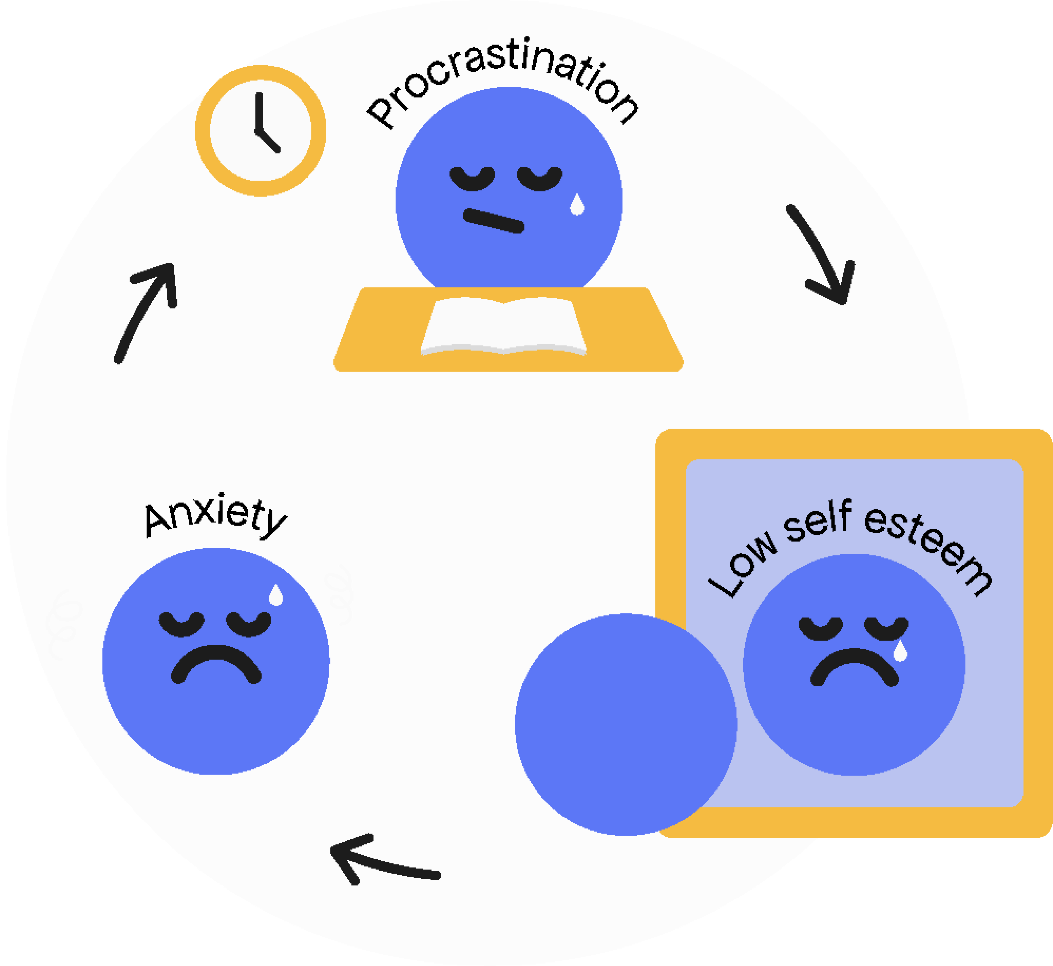
Anxiety related to productivity makes individuals feel overwhelmed by their schedule and fear the process of reaching a goal, and therefore tending to procrastinate, feeling regret in the end because they think they just wasted time.Higher procrastination also reported higher depression and anxiety, and more negative beliefs about their global self-worth.
How We Identified The Design Opportunity
Mind Model
Nowadays, we live in a hyper-connected and fast-paced society. Individuals are required to give always their best, which brings into a constant vicious cycle of hyperproductivity. This kind of lifestyle has been proven not to be sustainable on long-term, bringing to psycho-physical and health issues. According to studies, the ones who suffer most for this kind of productivity are young adults, also because of their relationship with technologies and the consequences of the post pandemic.
The Big Idea
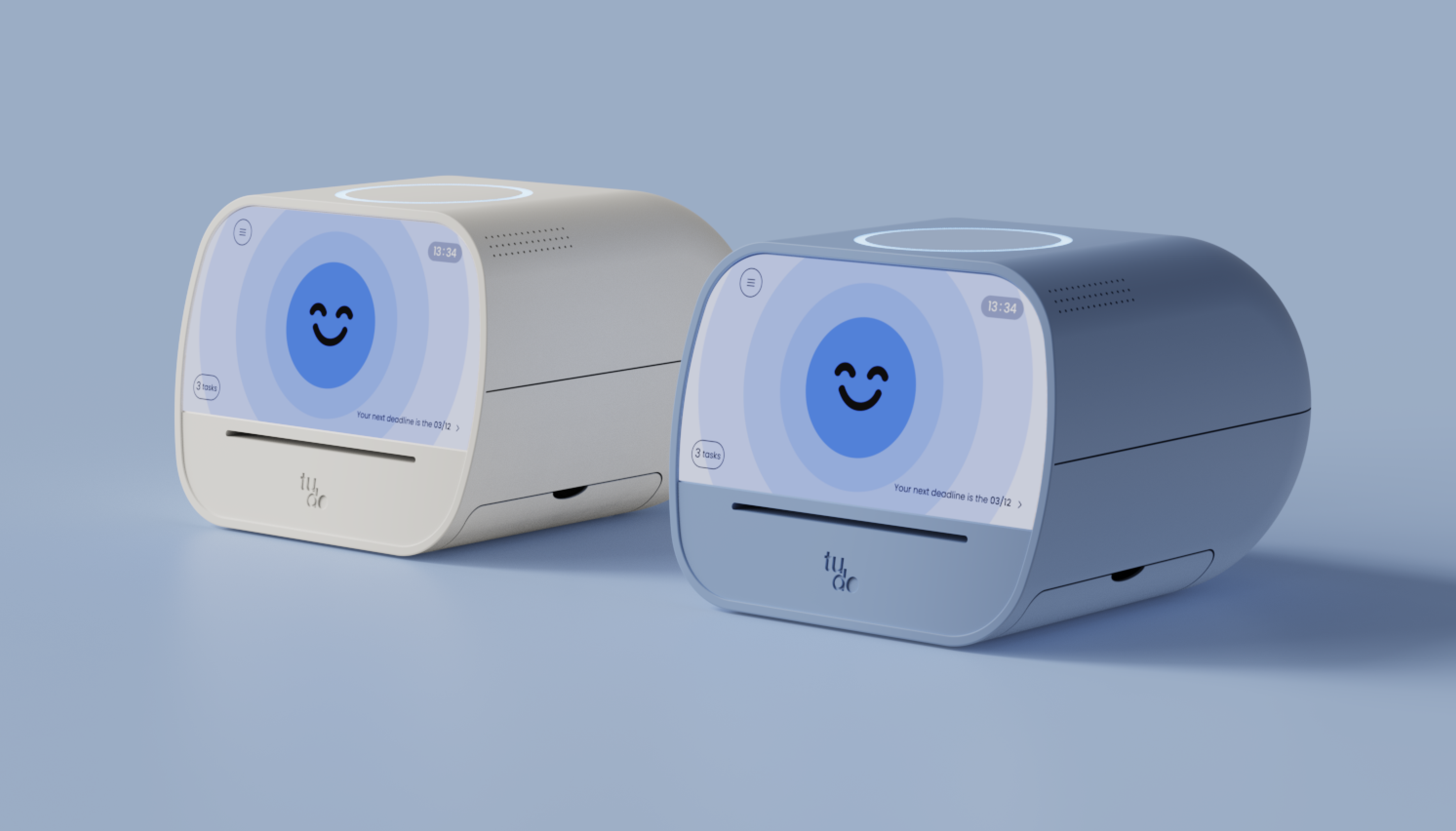
Creating a smart and personalisable task manager that is able to schedule and suggest tasks based on the user’s emotional state and habits. As a result, users are helped to find their own way to be productive, as well staying healthy along the way.
Design Process
Perception test
We tested the perception of users when it comes to different type of technologies that allow to track users’ anxiety while using the product.
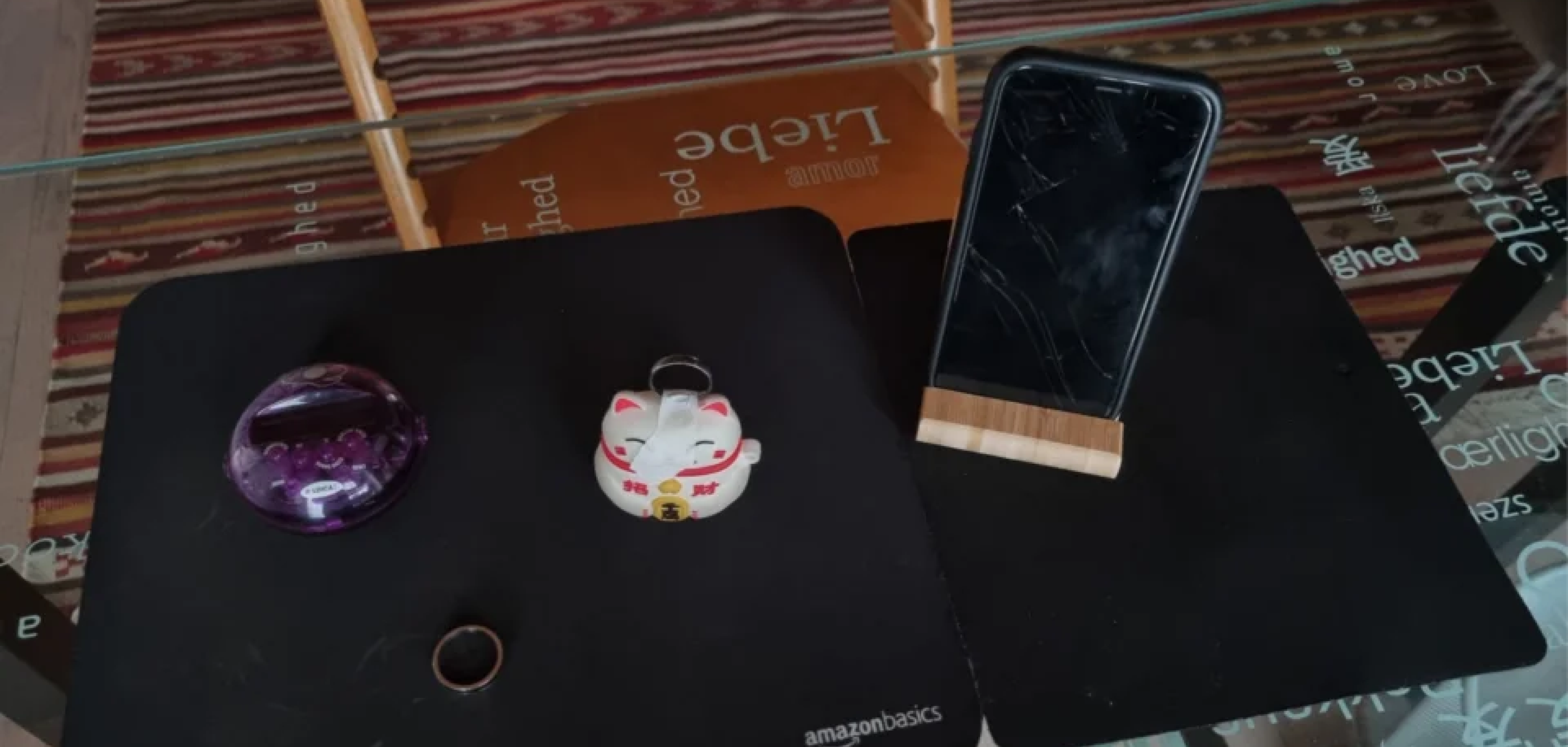
We used 5 random objects to simulates different solutions that embeds the 2 possible tracking technologies:
– Thermal camera: that tracks anxiety through users’ body temperature. Possible solutions don’t imply users’ interaction.
– EDA and ECG sensors: that tracks anxiety through users’ skin conductance and heartrate. Possible solutions require users’ interaction.
We asked to people to tell us which kind of solution was the most appreciated one, and for which reason.Users preferred the “less invasive”: we deducted that users want a solution that doesn’t create a friction between them and the product and doesn’t require too much effort.
Gesture test
The most important element to understand throughout the design process, was the interaction between users and Tudo: had to be intuitive, without requiring the effort of memory. We decided Tudo’s final shape based on several gesture tests results. We asked people to take precise tasks on different objects, to see with which gestures they reach the goal, and the level of naturalness of their action.
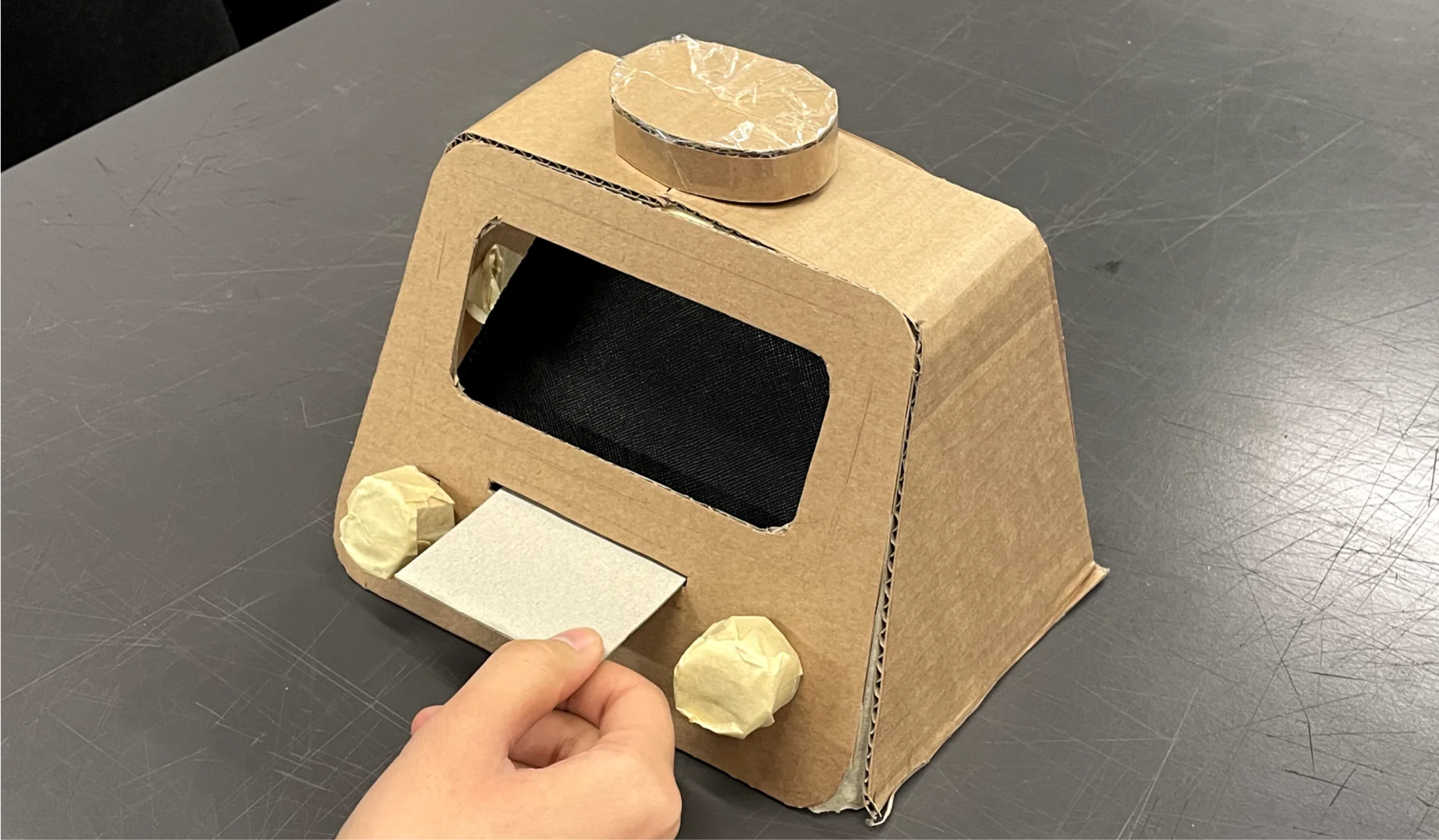
It emerged that when users had to perform a task related to the the working time (specifically “start a task”, “stop a task”, pausa a task”) all of them tapped on the object. This is comprehensible because this type of physical interaction really recalls the one of the alarm clock or timer.In all the other case they prefer to navigate the system via display, and for this reason we introduced the touch screen.
Input Test
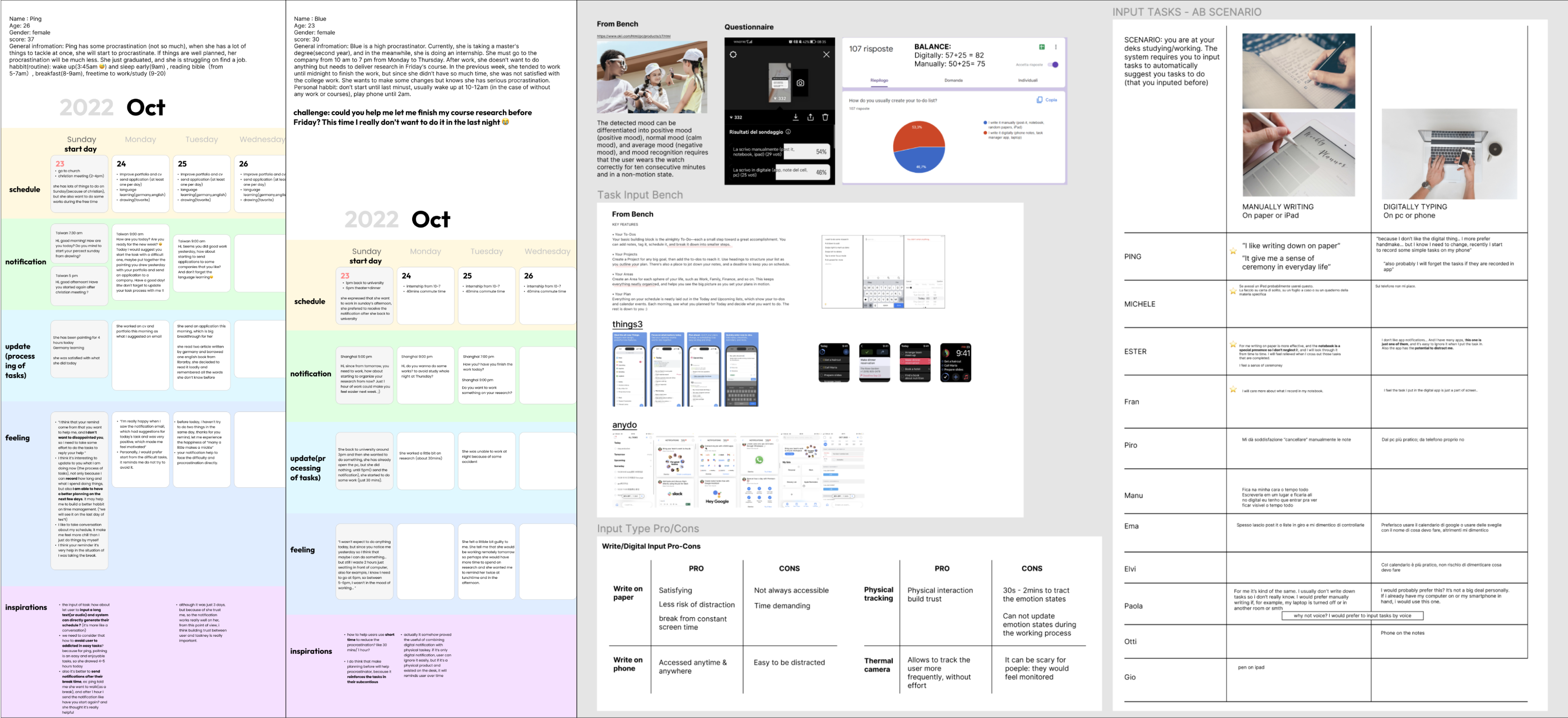
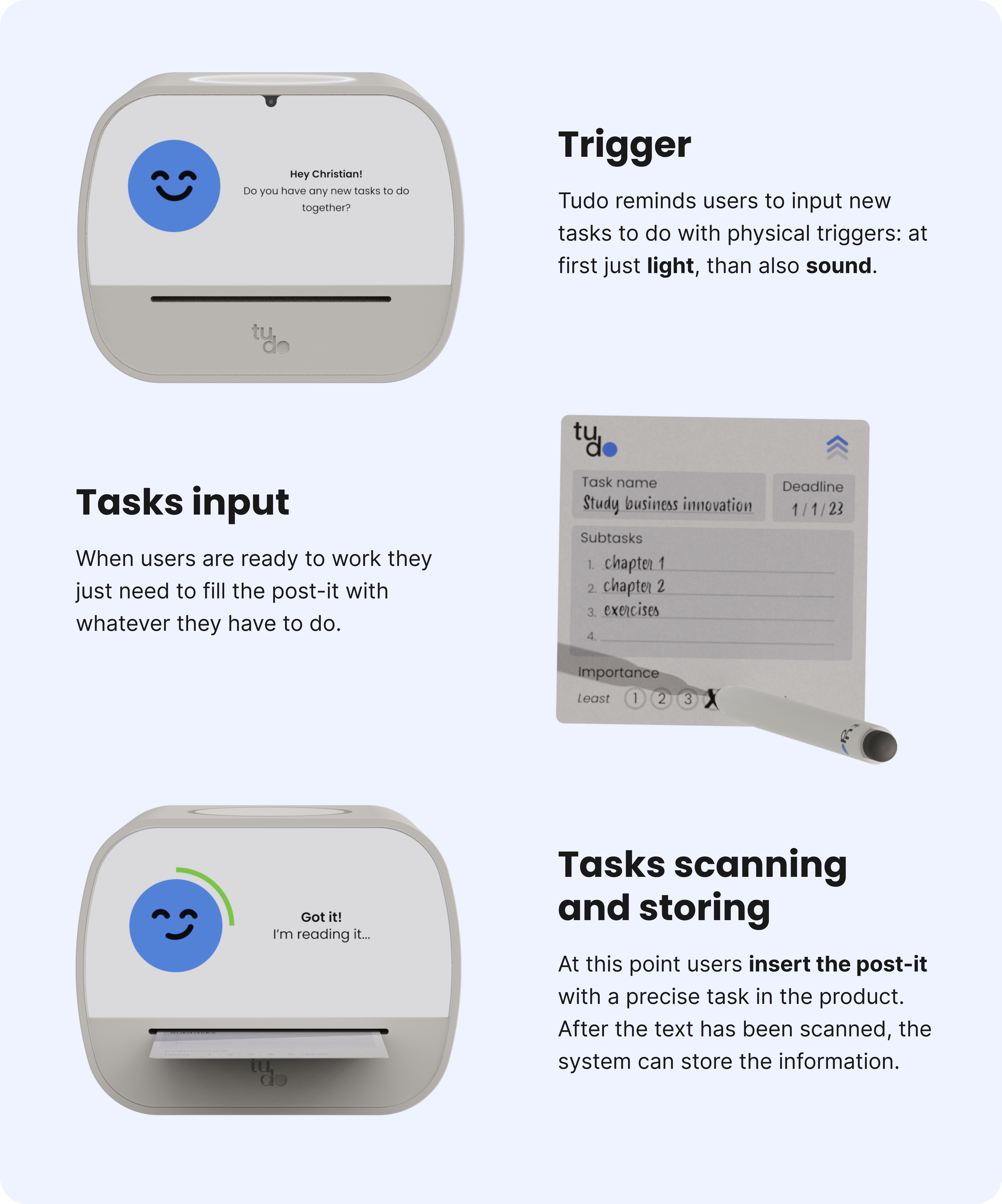
As task-input is one of the most critical features in this system, we conducted several rounds of testing to determine the optimal method for task input, whether via handwriting or digital input (e.g., through an app). Initially, we thought about creating an app since to-do lists are prevalent and it would be easy to prototype. However, after conducting research and interviews, we found that although the voting results were split evenly between digital and paper methods, those who make a conscious effort to avoid procrastination prefer to write down their tasks on paper. Additionally, many users mentioned that handwriting tasks on paper is a special experience they value, even if it may not be as convenient as using an app. Furthermore, we also considered that allowing users to input tasks through an app could increase the risk of procrastination, as they may get distracted by messages from other apps. Thus, based on these reasons, we decided to create a specific post-it note for users to write down their tasks and implemented technology to read the handwriting and display it digitally on the product.
Moreover, we also tested different ways to send information to users and the layout of the post-it note.
The System
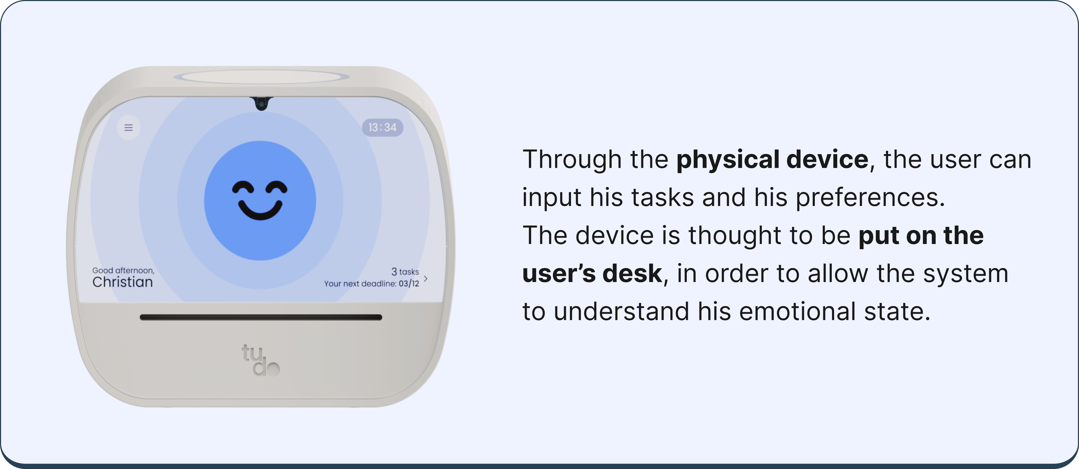
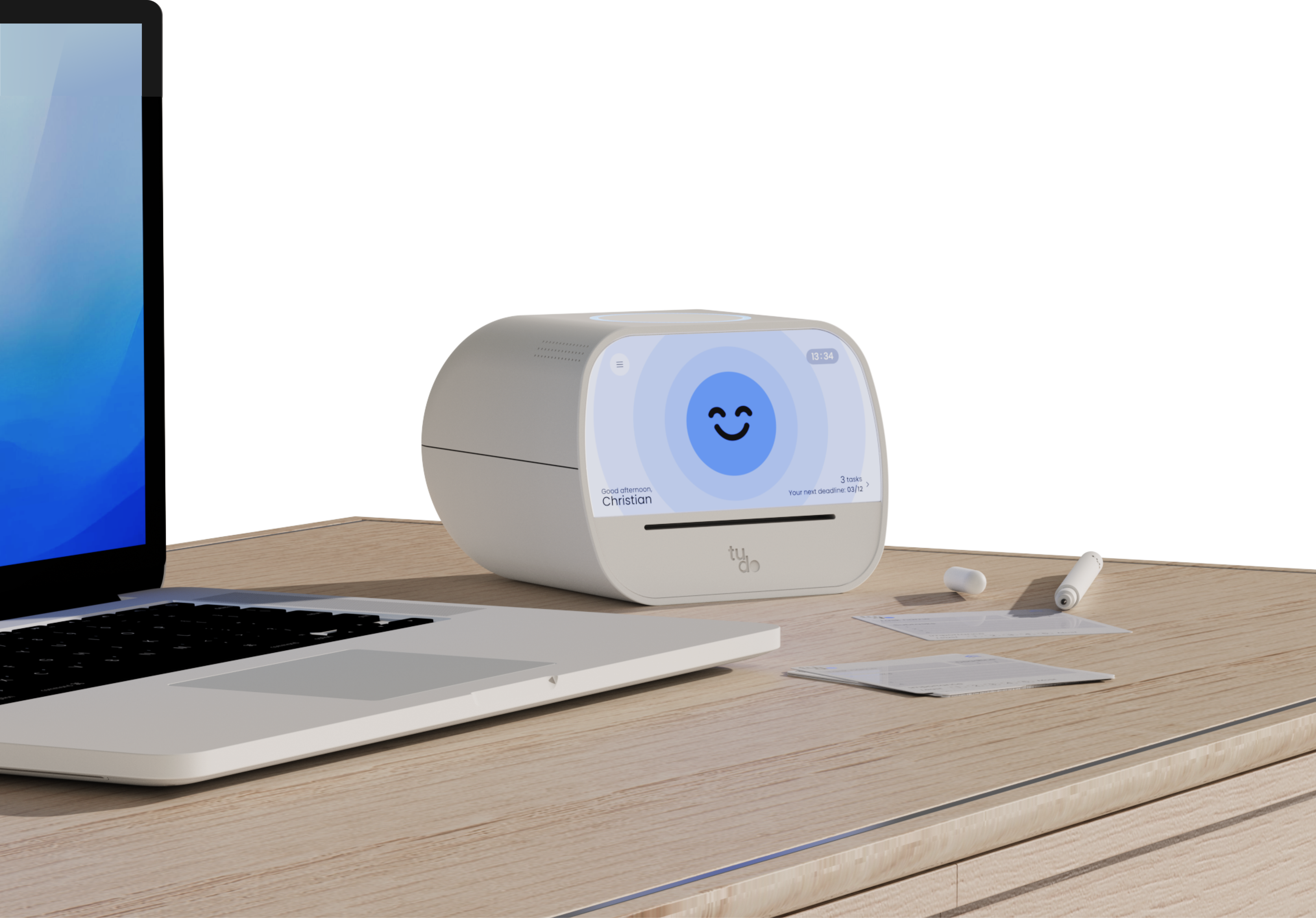
Standalong Device
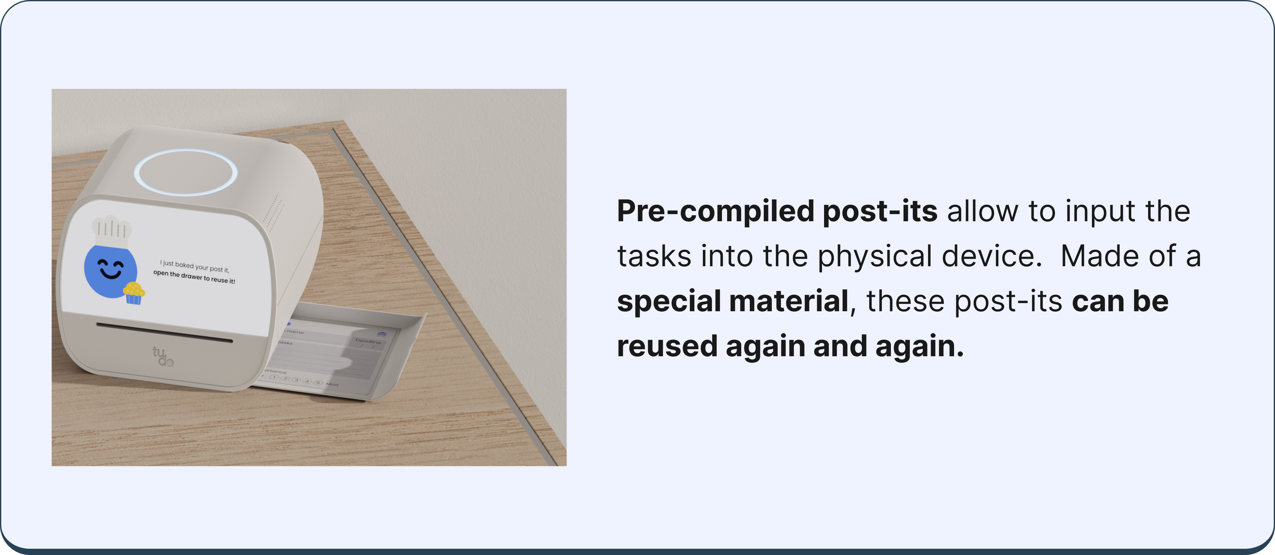
Post-its
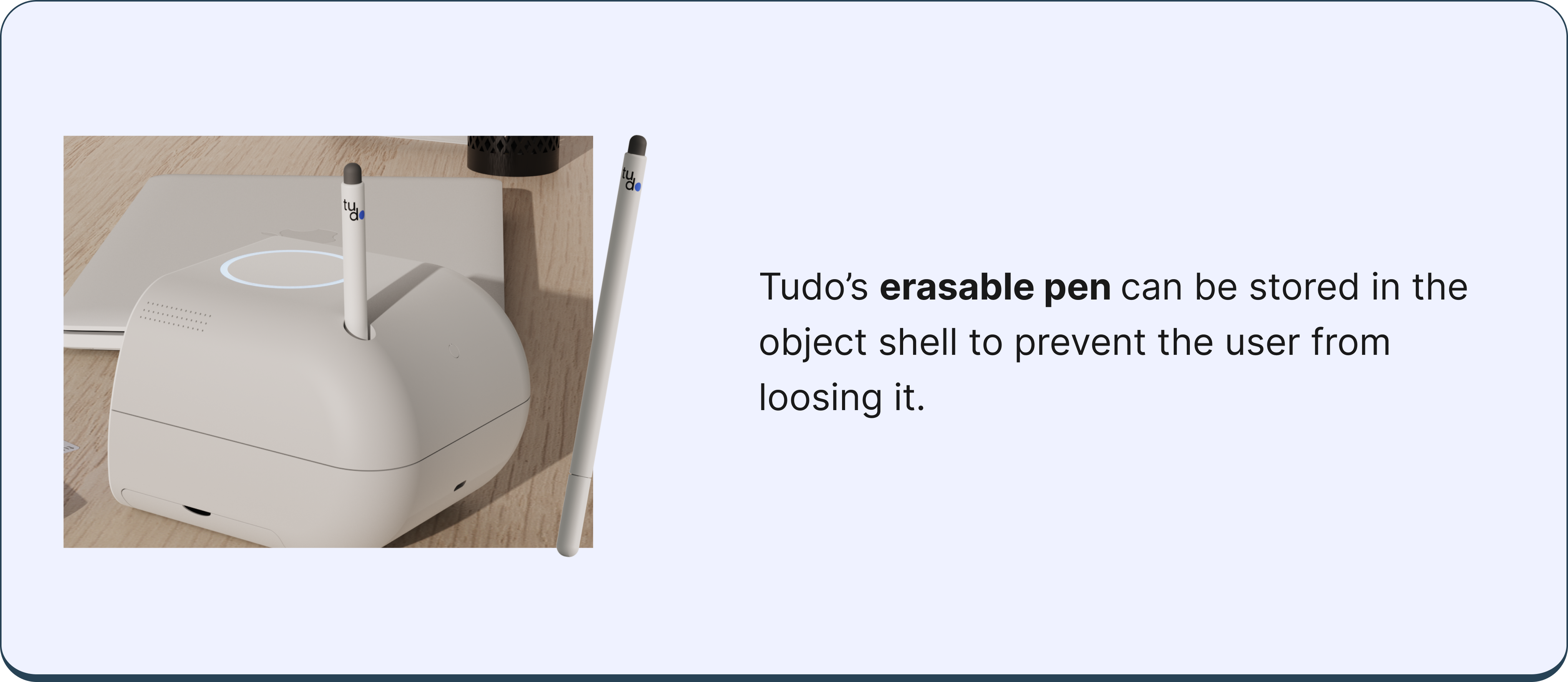
Pen
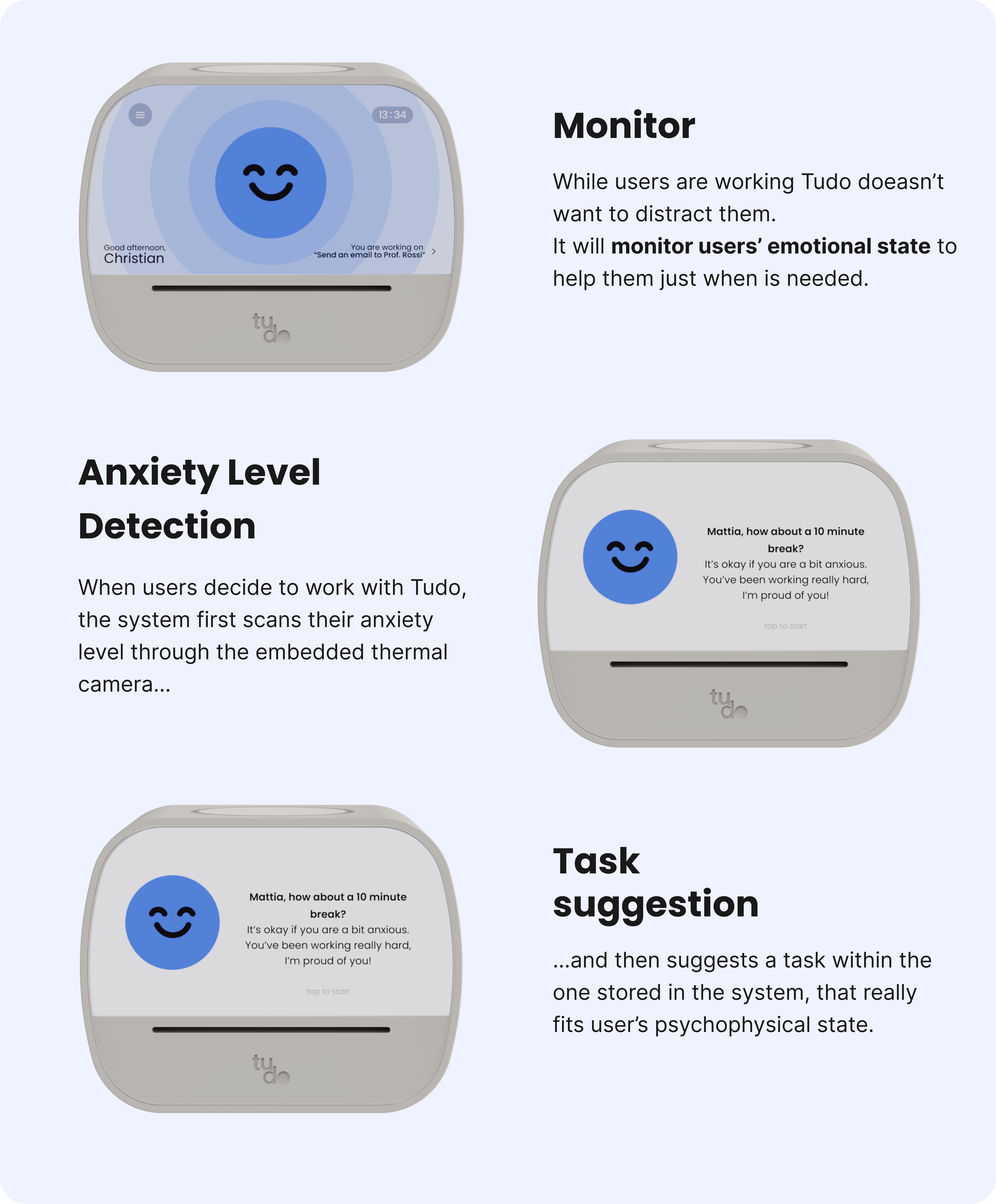
How It Works
1. Input New Tasks
2. Start Working
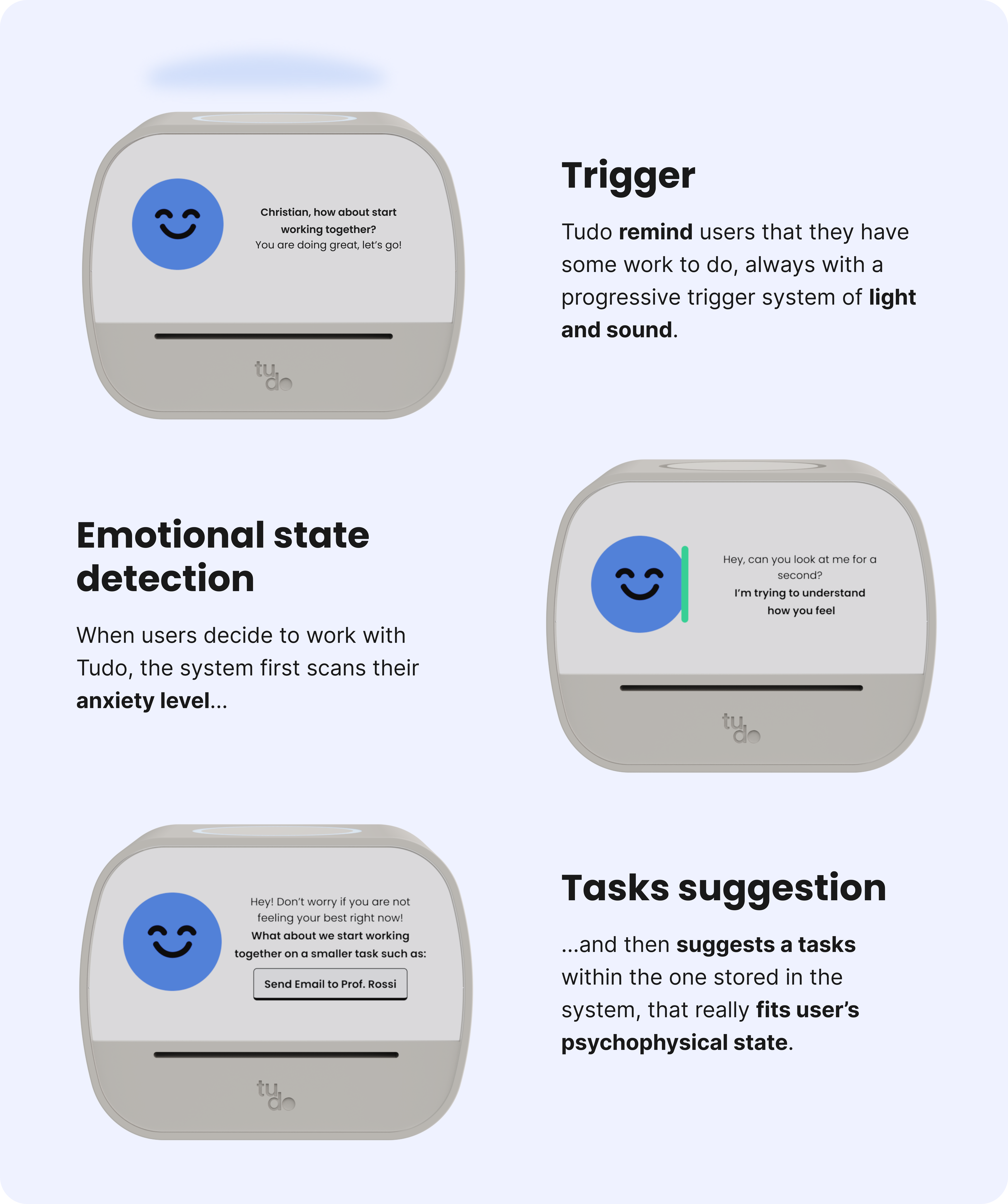
3. While Working
Prototpe
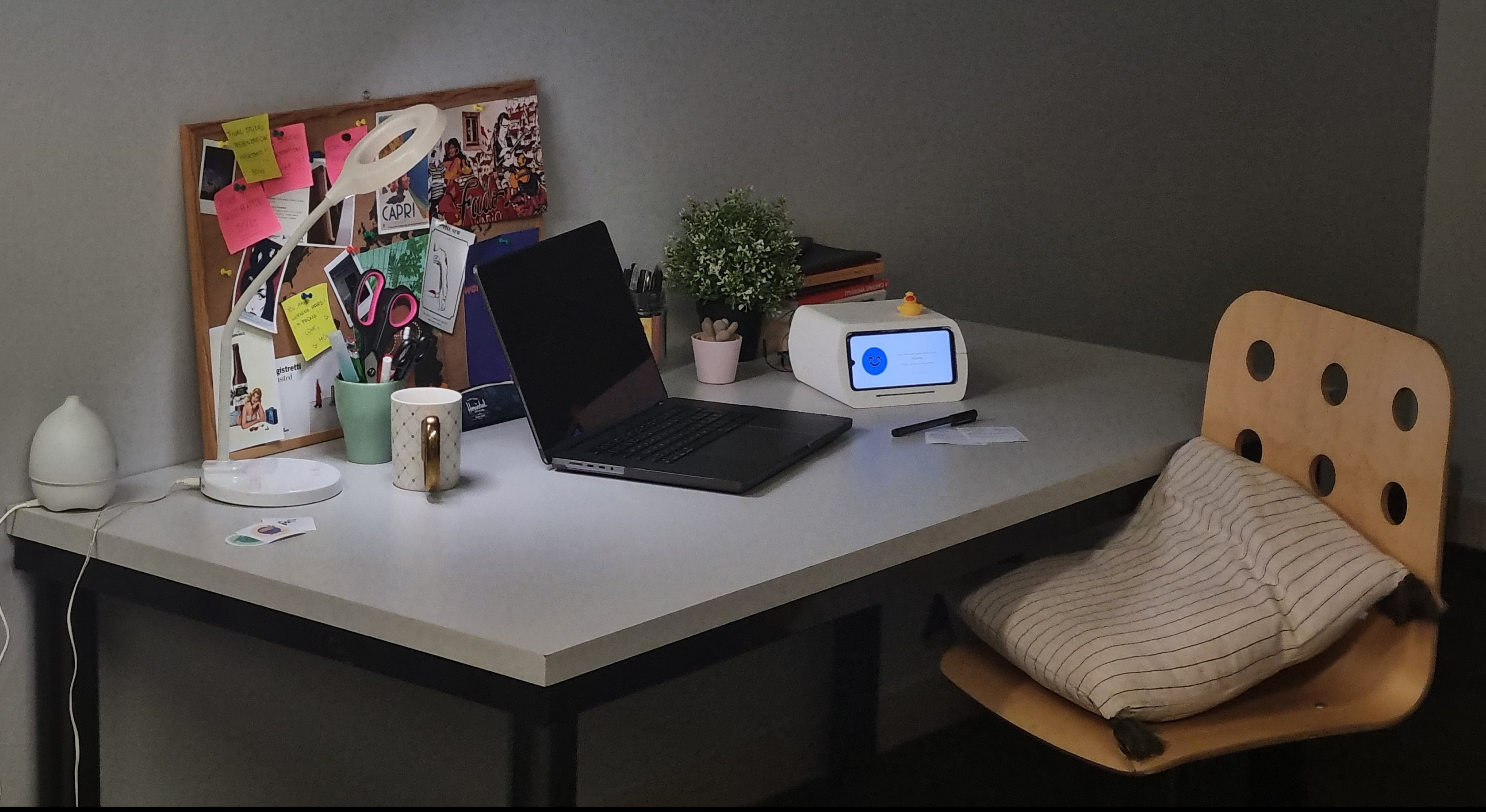
Technology Implementation
For the functional prototype we planned to prototype the two main features of the MVP: the post it scanner and the suggestion of tasks based on anxiety and preferences.
Camera scanner
To capture the photo, we used an ESP32 cam for the camera scanner. To ensure high-quality results, we experimented with different lens dimensions, the distance between the post-it and the camera, and the addition of LED lights.
For the text recognition phase, we tested two algorithms: tesseract.js and Google API-VISION AI. The accuracy of recognition improved by 80% when we switched from the first algorithm to the second.
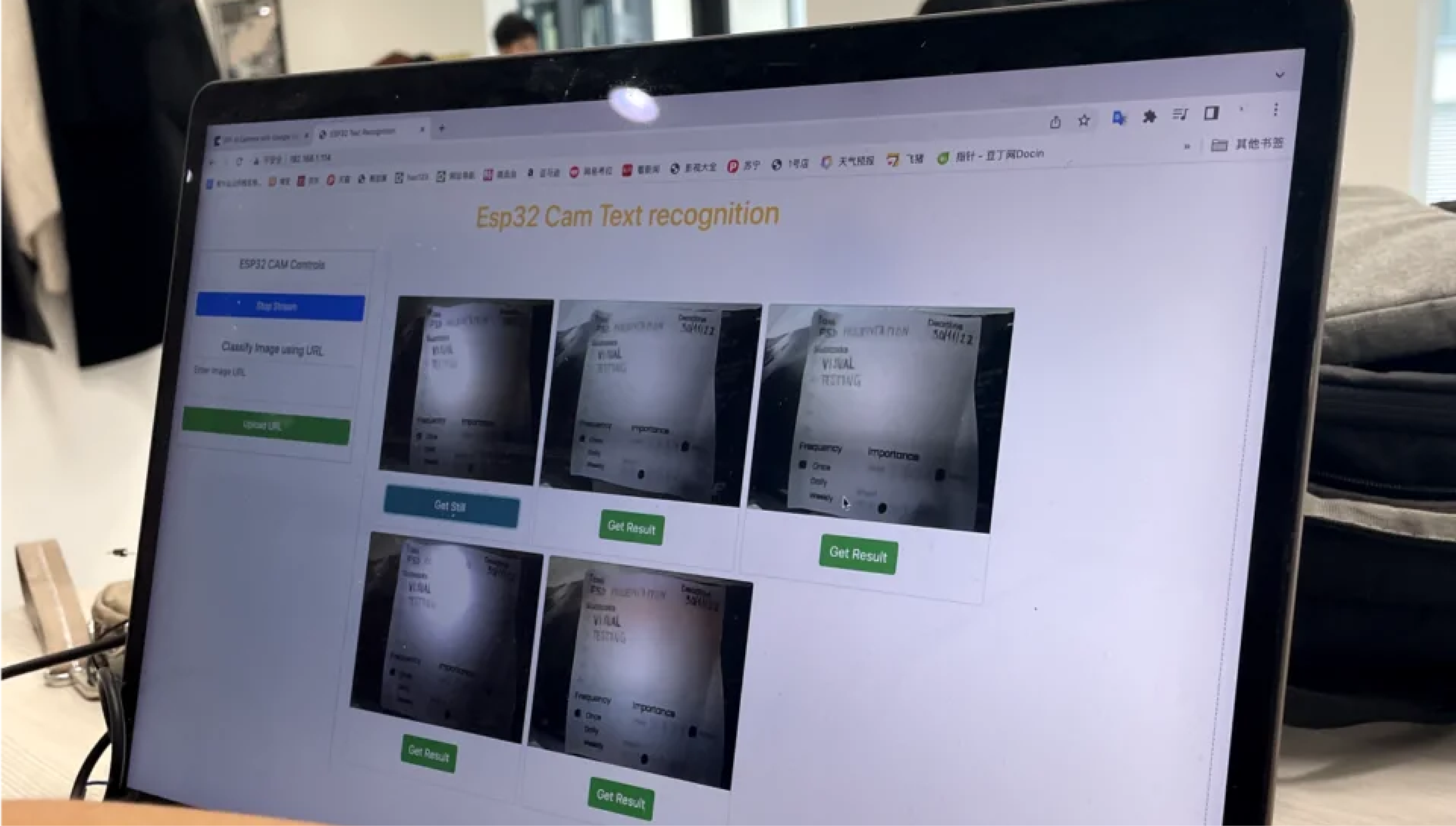
Camera scanner
We used EDA and ECG sensors, which respectively track electric skin conductance and heart rate, to determine the anxiety level of users. Unfortunately, due to the inaccuracy of the purchased sensors, we were unable to embed them into our prototype.
As backup plan, we tested the level of anxiety of users with the ECG sensors embedded into a smartwatch, and adjusted the messages sent to the user on the UI accordingly.
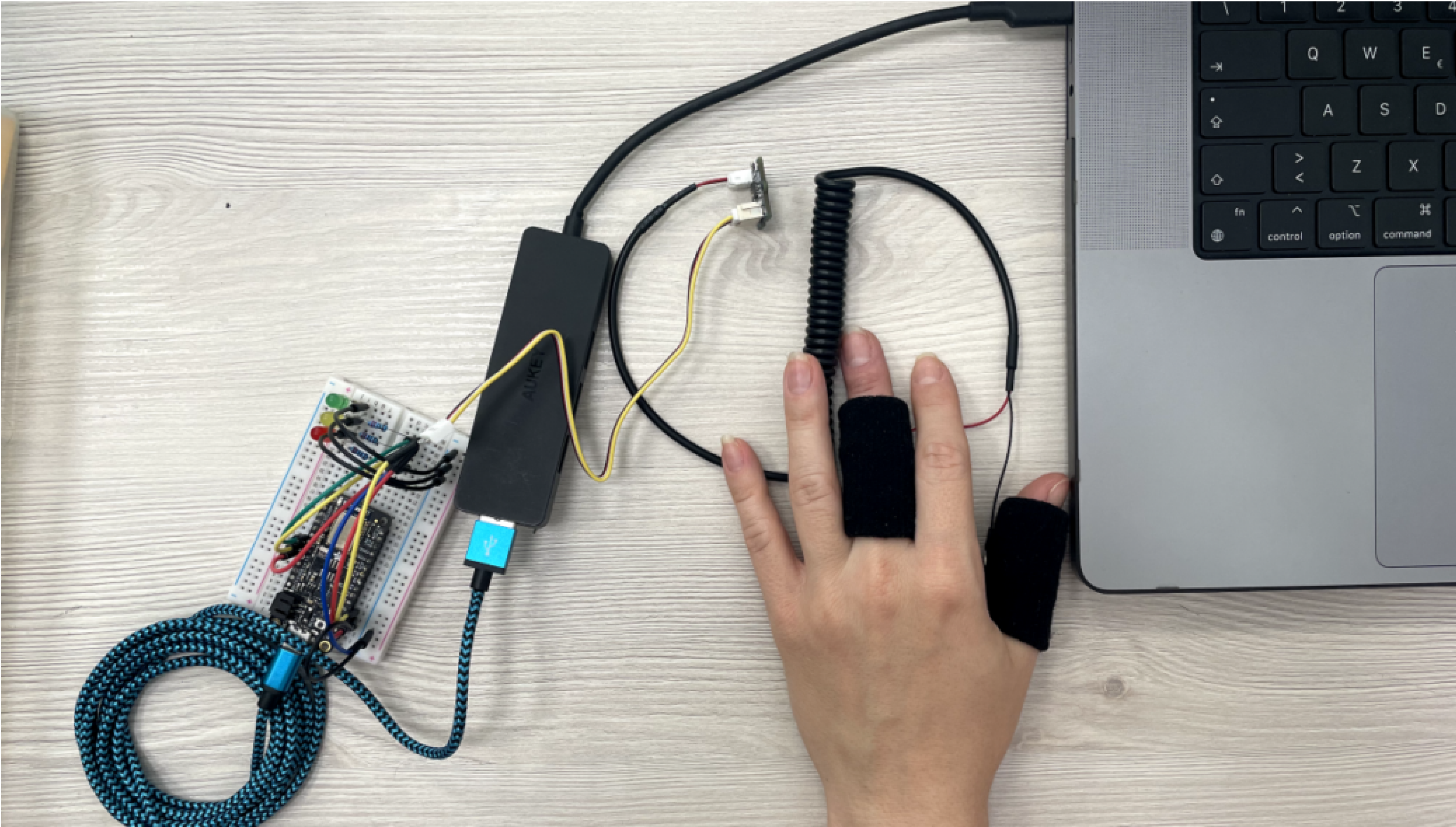
UI
Demo
Future Development
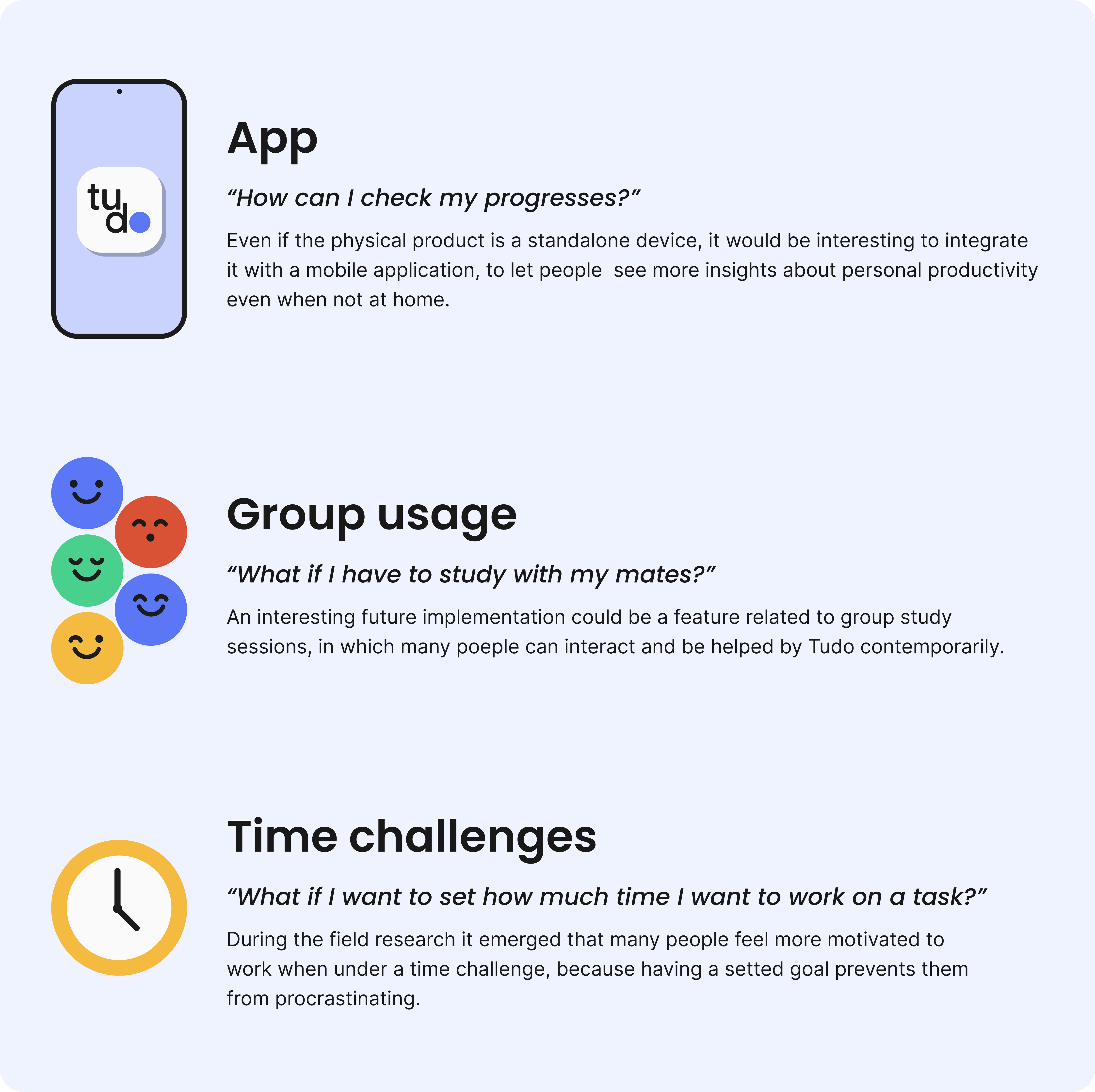
We adopted an agile design process, trying to involve people and potential user from the early stage of the research, interviewing and testing the prototypes with them. This really allowed us to gathered precious insights also concerning possible further developments.
Conclusion
Overall the product type of interaction, appereance and features where appreciated by users, especially Tudo character was perceived as reassuring and pleasant to work with.
The combination of physical gesture and on-screen interaction has been simplified during the design process thanks to the users’ feedbacks, in order to reach a very intuitive and natural usage, which doesn’t create a friction within the flow of use.
The most important thing for us was discussing with our peers, which gave a concrete proof of all the theoretical research we did aroud the topic. Seeing real people relating to the problem of toxic productivity and perceiving the value of Tudo was our biggest achievement.
Team Members
Luca Maserati
Carlotta Castenetto
Xiyuan Hu
Federica Sciretta
Mattia Salamida
Amanda Trotta
